A modern kitchen feels more dynamic with contrasting colors. This approach adds visual interest and defines different zones. You can use color to highlight an island, create a feature wall, or make your cabinets stand out. The combinations that follow are bold yet balanced. They show how two strong colors can work together to make a space feel complete and personal.
1. Navy Blue & Crisp White Duo
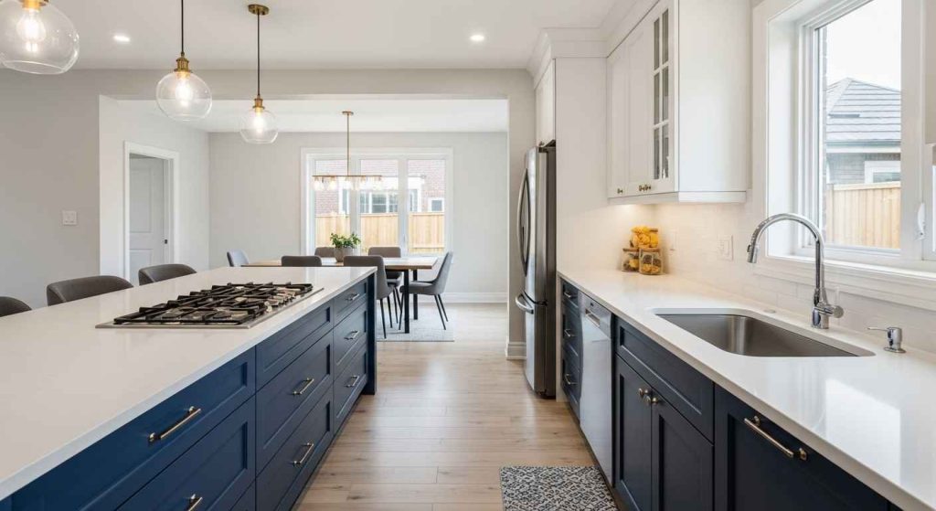
This classic pairing is both timeless and striking. Use navy for the lower cabinets to ground the space. Keep the uppers and walls white to maintain a light, open feel. The dark color hides smudges well, which is great for busy areas. Paint just the island for a high-impact change without a full cabinet overhaul. This is a simple way to test the look. A glossy finish on the navy cabinets will catch the light beautifully.
2. Charcoal Gray & Vibrant Citrus
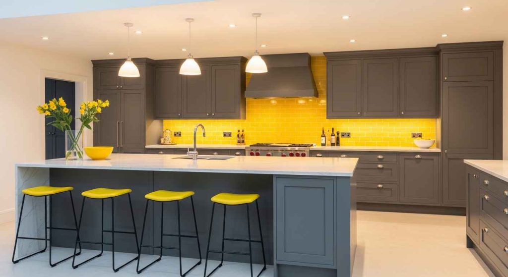
Charcoal gray provides a sophisticated, neutral base. Introduce a citrus hue like lemon or lime for a burst of energy. Use the bright color in small, manageable doses. Think bar stools, small appliances, or a single accent wall. A colorful backsplash is an easy update that can be done over a weekend. This keeps the commitment low but the style high. The gray keeps the citrus from feeling overwhelming, creating a perfect balance.
3. Deep Emerald & Warm Brass

Emerald green brings a sense of luxury and depth to a kitchen. Pair it with warm brass hardware and light fixtures for a rich, cohesive look. The metal’s warmth keeps the deep green from feeling too cold. Swap out cabinet pulls and faucets to introduce brass without a big expense. This combination works well with natural wood elements and marble countertops. It feels both classic and current.
4. Sleek Black & Bold Primary

Black kitchens are dramatic and modern. Adding a bold primary color, like a fire-engine red, creates an instant focal point. Use the bright color on an island, a set of chairs, or open shelving. Use colorful cookware as decor to add that pop of color without any permanent changes. This is a zero-cost way to experiment. The high contrast is energetic and perfect for a home that loves a strong style statement.
5. Forest Green & Natural Wood Tones

Forest green is a calming, earthy color that pairs beautifully with natural wood. Use it on cabinets and combine with wood open shelving or a butcher block countertop. The wood adds warmth and texture. Install floating wood shelves yourself for an affordable and stylish storage solution. This combination brings an organic, grounded feel to the space. It works well in homes that have a connection to the outdoors.
6. Midnight Blue & Terracotta Accents

Midnight blue is a deep, almost black shade that feels cozy. Terracotta accents bring a Mediterranean warmth that keeps the room from feeling too dark. Introduce this color through tiles, pottery, or small rugs. A terracotta planter with a herb garden adds life and color to your windowsill. This pairing is inviting and works well in kitchens with plenty of natural light. It feels both handmade and refined.
7. Warm Taupe & Electric Blue

Warm taupe is a versatile neutral that works with almost any color. Electric blue adds a modern, playful touch. Using this bright color on a single large appliance, like a refrigerator, makes a big statement. A statement appliance can be a fun splurge that defines the whole room’s color scheme. The taupe keeps the look sophisticated, allowing the blue to be the star. It’s a simple way to personalize a builder-grade kitchen.
8. Rich Burgundy & Matte Gold

Burgundy is a deep, romantic color that feels both traditional and modern. Matte gold hardware and lighting fixtures complement it perfectly, adding a touch of glamour without being too shiny. Update your lighting fixtures to incorporate the matte gold finish. This is a relatively small change with a major visual impact. The combination is rich and inviting, perfect for a kitchen that also serves as a gathering space.
9. Sophisticated Plum & Mustard Yellow
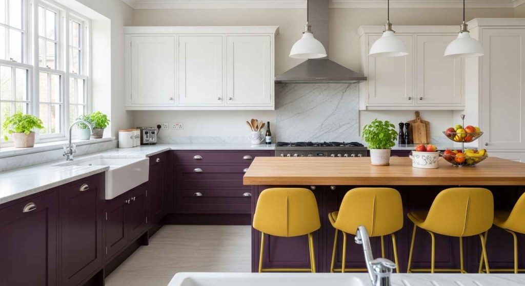
Plum is an unexpected and sophisticated choice. Mustard yellow is its complementary color, creating a vibrant and stylish contrast. Use the plum on cabinets and add mustard through textiles like seat cushions, curtains, or a runner. Re-cover old bar stool seats with a bold mustard fabric for a custom look. This pairing is creative and full of personality. It shows a confident use of color.
10. Jet Black & Cherry Red

For a high-drama kitchen, pair jet black with cherry red. The black creates a powerful backdrop, while the red adds passion and energy. Introduce red through accessories you already own, like a kettle or a set of canisters. Use your existing red accessories to create a cohesive look without buying anything new. This combination is bold and timeless, reminiscent of a classic diner but with a modern edge.
11. Dusty Pink & Navy Blue

Dusty pink is soft and welcoming, while navy blue is strong and classic. Together, they create a balanced and chic look. Paint your walls pink and use navy for furniture or shelving. A navy blue rug can anchor the space and is easy to change out if you want a new look later. This pairing feels both gentle and structured. It’s a great way to add color without it feeling too loud.
12. Olive Green & Burnt Orange

Olive green is a muted, earthy tone. Burnt orange brings a retro, autumnal warmth. This combination feels organic and cozy. The orange works beautifully as a backsplash or in textiles like window valances. Paint a single cabinet door in burnt orange to see if you like the combination before committing to a larger project. These colors work well with wood and wrought iron details.
13. Steel Gray & Sunshine Yellow

Steel gray is a cool, industrial neutral. Sunshine yellow injects instant optimism and light. Use the yellow on elements that catch the eye, like chair cushions, a small appliance, or even the inside of open cabinets. Line your open shelves with yellow contact paper for a temporary and cheap color pop. This contrast is cheerful and modern, perfect for waking up a utilitarian space.
14. Royal Blue & Copper Details

Royal blue is a confident, vibrant color. Copper details add a rustic, warm metallic touch. The combination is both striking and homey. A copper sink or range hood makes a beautiful statement. Polish copper pots to a high shine and display them prominently. This not only adds to the decor but is also a practical use of your cookware. The metallic sheen against the blue is visually rich.
15. Chocolate Brown & Sky Blue

Chocolate brown cabinetry feels warm and substantial. Sky blue on the walls or backsplash keeps the space feeling light and airy. This pairing is calming and reminiscent of the natural world. A sky blue paint color is an easy weekend project that can completely change the room’s feel. The brown grounds the space, while the blue opens it up. It’s a very approachable way to use darker wood tones.
16. Slate Blue & Coral Pops

Slate blue is a gentle, grayish blue that serves as a serene backdrop. Coral is a warm, peachy pink that adds a lively pop. Use coral in your seating, small appliances, or art. Add coral with a set of dish towels for a low-cost and easily changeable update. This combination feels fresh and coastal without being thematic. It’s playful yet relaxed.
17. Graphite & Mint Green Freshness

Graphite is a deep, sophisticated gray. Mint green brings a cool, retro freshness. Using mint on a single large element, like a refrigerator or an island, creates a clear focal point. Look for secondhand appliances in unique colors to save money and add character. The mint provides a surprising and pleasant contrast to the dark gray, making the kitchen feel both modern and fun.
18. Inky Black & Zesty Lime

Inky black creates a dramatic, modern canvas. Zesty lime green is energetic and bold. This high-contrast pairing is full of life. Use lime green in small, vibrant hits. Paint the inside of your glass-front cabinets lime green for a hidden surprise. This is a fun DIY project that adds personality without being overwhelming. The combination is perfect for a home that isn’t afraid of color.
19. Deep Teal & Warm Wood

Deep teal is a rich, jewel-like color. Pairing it with warm wood tones creates a balanced and inviting space. The wood adds natural texture and warmth that softens the intensity of the teal. A butcher block countertop is a durable and affordable option that introduces warm wood. This combination feels both luxurious and lived-in. It works especially well in kitchens with plenty of natural light.
20. Crimson & Cool Gray Balance

Crimson is a powerful, attention-grabbing red. Cool gray provides a neutral, calming balance. Let the crimson shine on one major element, like a classic stove or a feature wall. A bold red stove can be a lifetime investment that defines your kitchen’s style. The gray allows the red to be the hero without competing. This is a classic and powerful combination.
21. Mustard & Deep Indigo

Mustard yellow is warm and spicy. Deep indigo is a rich, almost black blue. Together, they create a sophisticated and globally-inspired palette. Use mustard on the walls and indigo on the cabinets. Try a sample pot of each color on a large board to see how they look together in your kitchen’s light. This pairing feels artistic and deeply personal.
22. Sapphire & Blush Pink

Sapphire blue is a vibrant, royal blue. Blush pink is its soft, gentle counterpart. This pairing is unexpectedly beautiful and modern. Use the pink in a tiled backsplash or on an accent wall. Blush pink peel-and-stick tiles offer a temporary way to test this look. The combination is both bold and soothing, perfect for creating a kitchen that feels unique and stylish.
23. Umber & Seafoam Green

Umber is a rich, earthy brown. Seafoam green is a soft, calming pastel. This combination feels natural and serene, like a forest meeting the sea. Paint your walls seafoam to brighten the room and let the umber cabinets anchor it. Seafoam green is a forgiving color that looks good in any light. This is a gentle way to use contrast without high drama.
24. Maroon & Sage Green Serenity
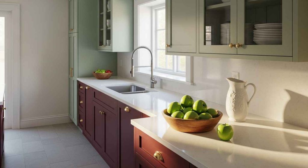
Maroon is a deep, wine-red color. Sage green is a muted, soft green. Together, they create a palette that is both rich and restful. This is a great two-tone cabinet look. Use two different paint finishes—perhaps matte for the green and satin for the maroon—to add subtle texture. The combination feels traditional yet completely current, offering a sense of quiet sophistication.
25. Violet & Goldenrod Accents

Violet is a creative and luxurious color. Goldenrod yellow is a warm, mustardy accent that makes it pop. Use violet on the walls and bring in goldenrod with textiles and lighting. A goldenrod yellow lampshade can change the whole feel of your overhead light and add a warm glow. This pairing is artistic and confident, perfect for someone who wants their kitchen to be a true expression of their style.
26. Tangerine & Deep Navy

Tangerine is a zesty, energetic orange. Deep navy is a classic, stable blue. This combination is full of life and perfect for a social kitchen. Use tangerine in your floor rug, small appliances, or dishware. A bright runner is an easy first step into this color story. It’s a simple item to replace if you change your mind. The navy provides a strong base that lets the orange truly sing.
Start with one small element. Paint a single wall or change your cabinet hardware. See how the new colors make you feel in the space. A small change can give you the confidence to try something bigger. Your kitchen should be a place you love to be.