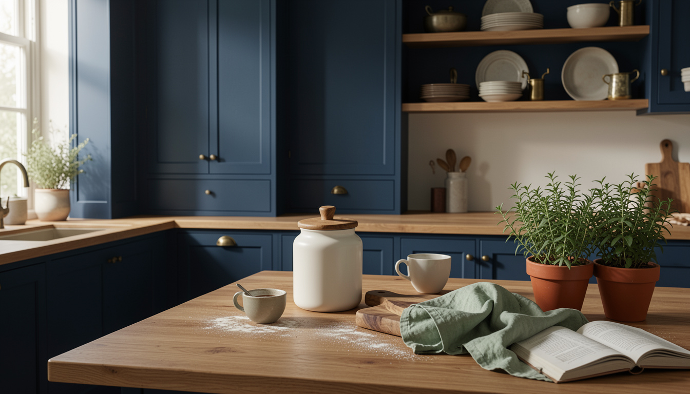
I painted my lower cabinets navy and immediately got two reactions. People loved the color, but the room felt heavy.
How to style blue kitchen cabinets so the room feels balanced is the question I had to answer while on a tight budget. I spent about $350 to re-layer surfaces, lighting, and a few accessories.
You’ll learn simple swaps that create balance, the items I bought, and three mistakes that ruin blue cabinets fast.
Kitchen vibe: modern coastal with warm rustic notes. This suits medium to large kitchens with white walls or light subway tile. Budget: around $200 to $600 for a noticeable refresh. I’ve noticed designers leaning toward warmer metals and linen textures in 2025 trends, which helps blue read less cold.
1. Start with the Foundation: Counter and Cabinet Reset
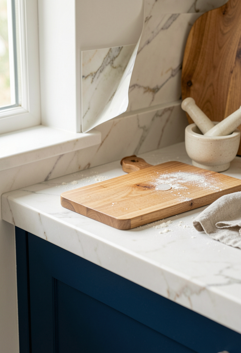
Begin here because the counter area reads as one continuous plane against bold cabinets. If the counter is too dark it competes. If it is too busy the blue disappears.
Swap in a warm cutting board to break the color block. I use an Acacia cutting board 18×12 around $25 to $50 and lean it against the backsplash for scale.
For a renter-friendly tweak, try Marble contact paper peel and stick approx $15 to $35 to brighten the splash zone.
Visual principle: a mid-tone horizontal element like wood balances saturated vertical cabinet faces. Keep deck clutter to a third of counter length. A common mistake is filling the entire counter with appliances. That makes cabinets feel boxed in. Instead leave negative space, place a single large board (18 inches tall) and one ceramic piece to anchor the eye.
2. Layer Warmth with Wood and Linen Textures
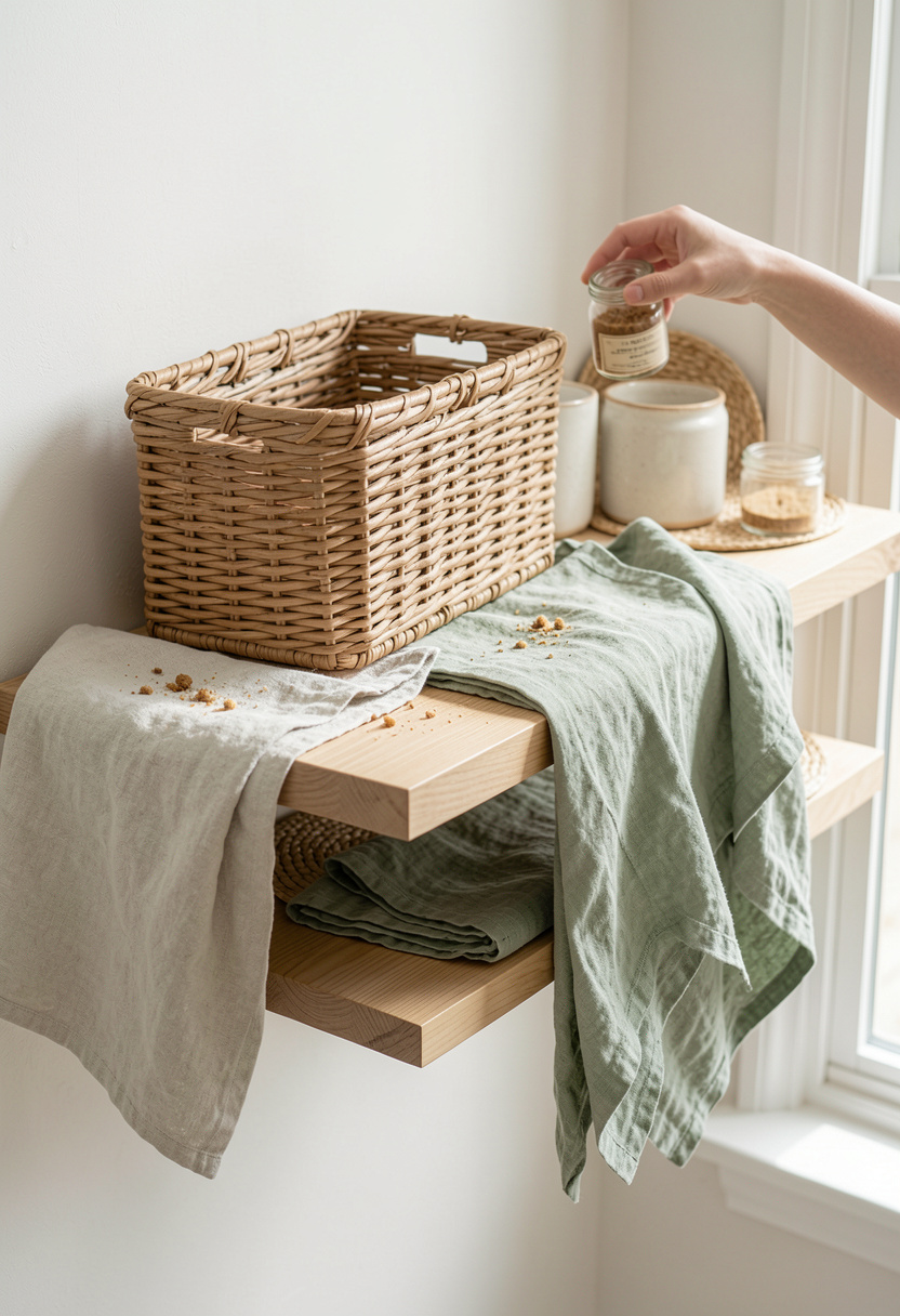
The trick is to soften the blue with warm, tactile layers. Wood and linen introduce mid-tones so the navy reads intentional.
Mount one or two Acacia floating shelves 24 inch and style them with a Stoneware dinner plate set 8 inch and a Rattan storage basket medium.
Principle: alternate textures in odd numbers. Three items on a shelf read calmer than two or four. Keep shelf-to-shelf spacing about 12 to 16 inches so the blue has breathing room.
People often over-accessorize shelves. That creates visual noise next to a saturated cabinet. Do fewer, larger pieces so the blue becomes the stage, not the backdrop.
3. Add Height and Drama with Open Shelving and Hardware
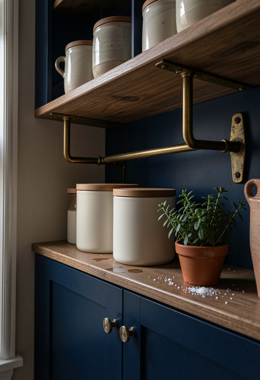
Open shelving pulls the eye up and offsets the weight of lower blue cabinets. I installed a single higher shelf and it made the room feel tall.
Use Brass shelf brackets 6 inch and style with a Matte white ceramic canister set with acacia lids.
Visual principle: vertical layering and repetition. Keep open shelves 18 inches above countertop for balance. Place taller items at the ends and stack plates centrally.
Mistake: lining up identical jars at the same height. That reads flat. Instead vary heights and mix open space with objects to create rhythm.
4. Create Ambiance with Warm Diffused Lighting
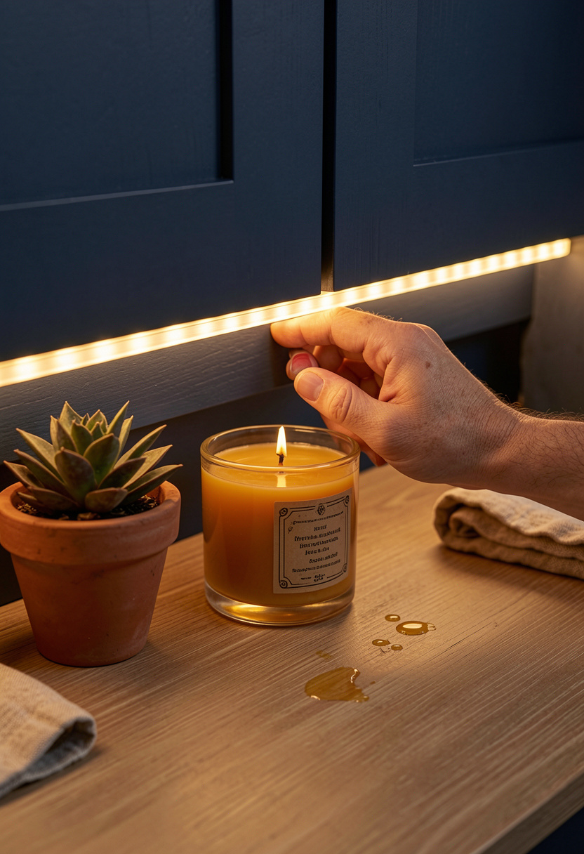
Blue cabinets can read cold under cool light. Swap in warm light and the blue looks rich rather than gloomy.
I use LED under cabinet warm strip lights approx $25 to $60 for task glow and a Brass pendant light 12 inch around $60 to $120 as a focal point.
Principle: layered lighting controls color temperature and depth. Add dimmable Edison LED bulbs 2700K dimmable 4 pack approx $12 to $30.
Many people only light the ceiling. That flattens the space. Add down and accent light to create warmth and depth.
Common Styling Mistakes to Avoid
Mistake: Filling counters with small ceramics
Why it doesn't work: Makes a saturated cabinet feel claustrophobic.
Do this instead: Pick one large statement like a Round acacia fruit bowl 12 inch around $25 to $60.
Mistake: Matching every metal finish
Why it doesn't work: Becomes monotonous and ages the palette.
Do this instead: Mix aged brass with matte black or stainless. Try Budget brass-look pulls pack of 6 approx $10 to $25.
Mistake: Too many tiny plants crowded on a shelf
Why it doesn't work: Reads cluttered next to bold color.
Do this instead: Use one Terracotta planter 6 inch and one herb pot for scale.
What You'll Need for This Look
Foundation Pieces
Acacia cutting board 18×12 around $25 to $50
Marble contact paper peel and stick approx $15 to $35
Round acacia fruit bowl 12 inch around $25 to $60
Textiles & Soft Goods
Sage linen dish towels set of 4 approx $18 to $35
Linen tea towels set of 6 $20 to $40
Small jute runner 2×6 feet $30 to $80
Lighting
LED under cabinet warm strip lights $25 to $60
Brass pendant light 12 inch $60 to $120
Finishing Touches
Matte white ceramic canister set with acacia lids $35 to $50
Herb pot kit 3 pack $12 to $30
Vintage brass soap dispenser $15 to $40
Budget Swaps
Peel and stick subway tile white cheaper than tile work; similar at HomeGoods for less
Shopping Guide for This Look
Buy the big pieces first: Get a large cutting board and one pendant to set scale. Acacia cutting board 18×12 about $25 to $50.
Seasonal timing: Shop brass lights after holidays; many fixtures discount in January. Brass pendant light 12 inch $60 to $120.
Thrift hack: Score art and frames at thrift stores and back them up with a similar small picture frame 8×10 $10 to $25.
Splurge vs save: Splurge on lighting, save on canisters. LED under cabinet warm strip lights $25 to $60.
Conclusion
Start with one visible swap: add a warm wood board and an under-cabinet light. That single move made my navy cabinetry feel intentional and roomy.
My last tip: let at least one horizontal surface be mostly empty. The eye needs a landing place next to bold color.
Which blue are you using and what one thing will you change first?