How to pick kitchen floor tile color without it dating your whole kitchen is the question I beat my head against for months.
I learned the hard way that the wrong undertone turns a fresh kitchen into a time capsule.
You’ll learn which neutral undertones to favor, three tile choices that age well, and how to style counters and lighting so your floor reads intentional. Budget: small refresh under $200, moderate update $300 to $1,200 for sample swaps and accents.
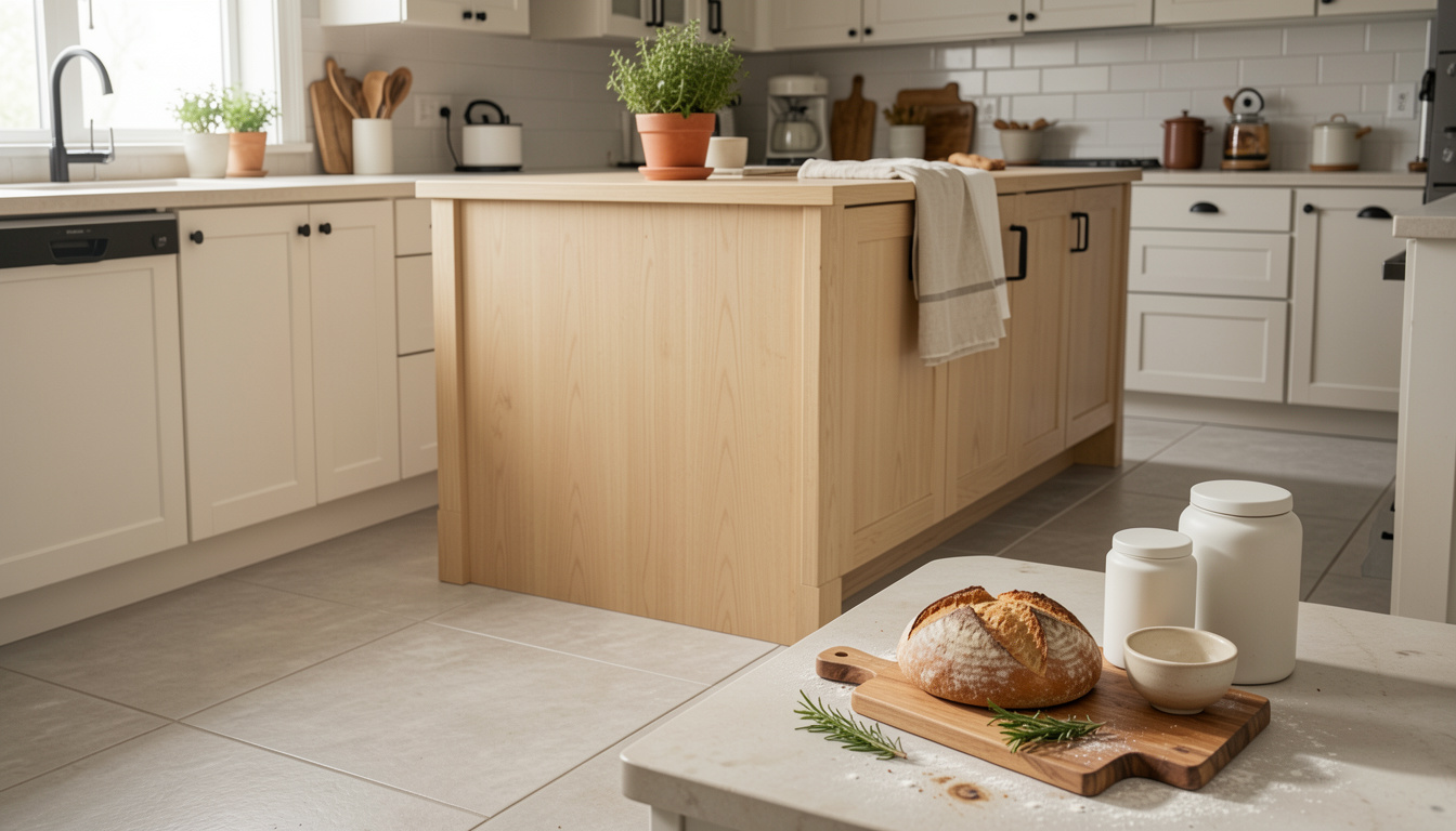
My kitchen leans modern farmhouse with pale oak and soft black accents. This method suits bright, airy kitchens and darker moody schemes if you flip the undertones.
I found most people are moving toward durable, neutral tile and sustainable materials, which helps future-proof a choice. Remodeling magazine’s 2023 Cost vs. Value report shows homeowners still recoup a significant portion of kitchen updates, so choosing tile that lasts visually matters.
1. Start with the Foundation: Counter and Cabinet Reset
Pick tile after you lock in cabinet and countertop undertones. The trick is matching undertones, not exact colors.
If your counters are warm (creamy quartz or marble with beige veins), choose floor tile with a warm greige undertone. If counters read cool (white quartz, cool marble), lean cool gray tile.
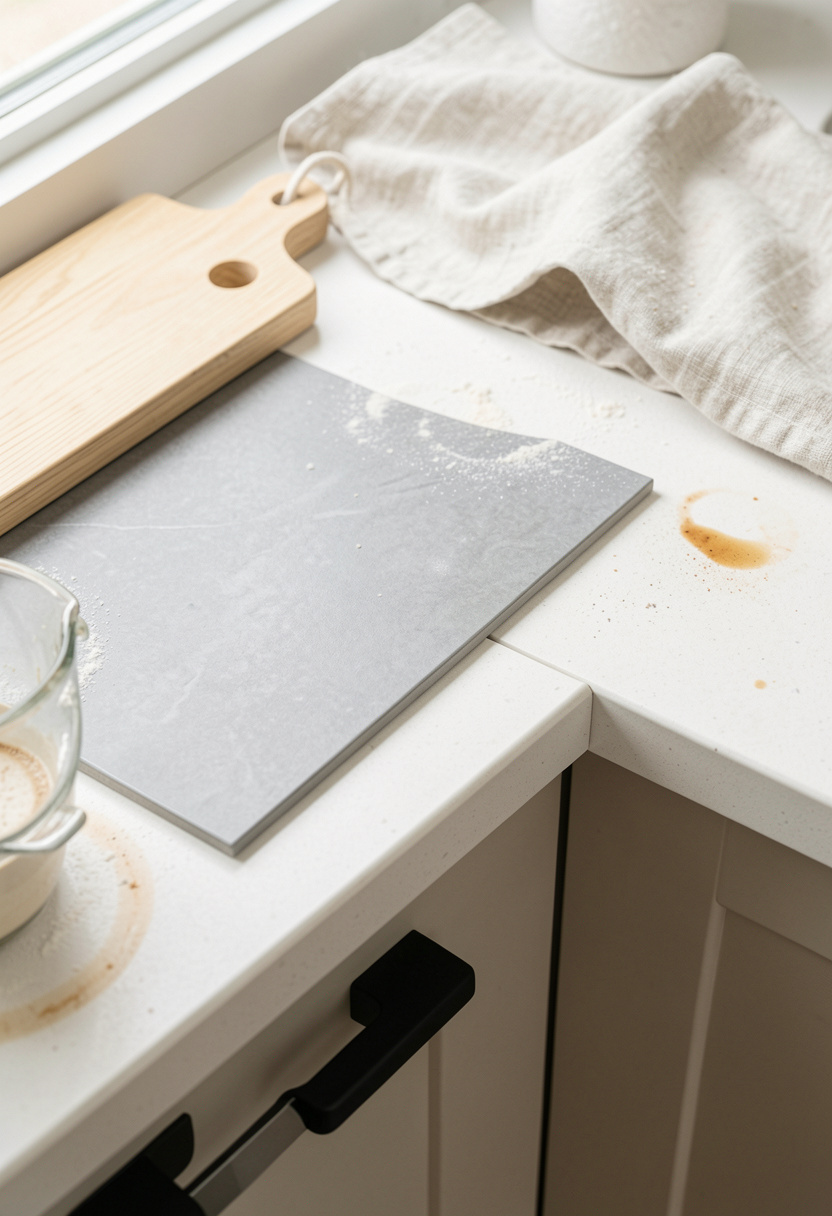
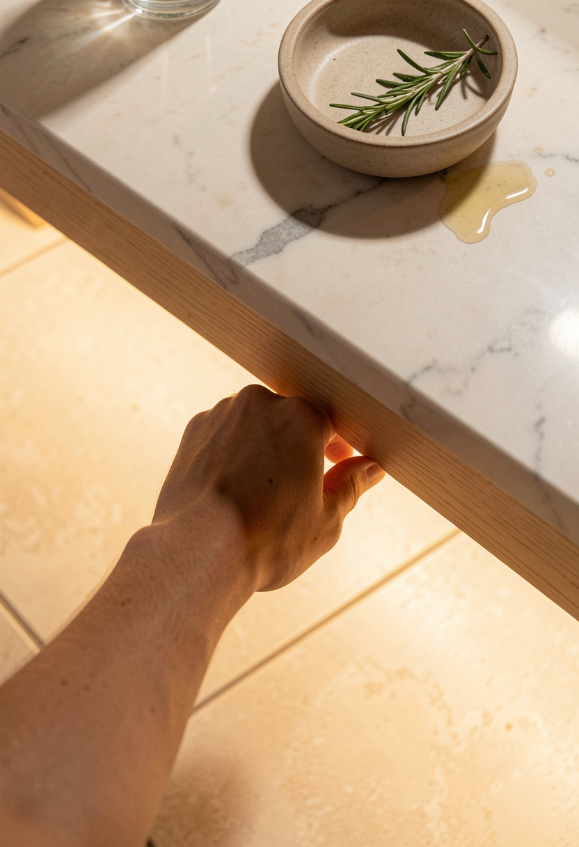
I ordered samples and compared them in morning and evening light. I also used a large 12×24 porcelain tile sample to see scale.
Two product helps: Porcelain tile sample 12×24 gray and Calacatta quartz sample let you compare undertones at home.
Visual principle: match undertones to avoid visual tension. Keep grout one to two shades darker than tile to hide everyday wear.
Common mistake: choosing bright white tile because it looks clean online. It often reads cold in person and shows dirt. Instead pick a soft warm gray or greige.
2. Layer Warmth with Wood and Linen Textures
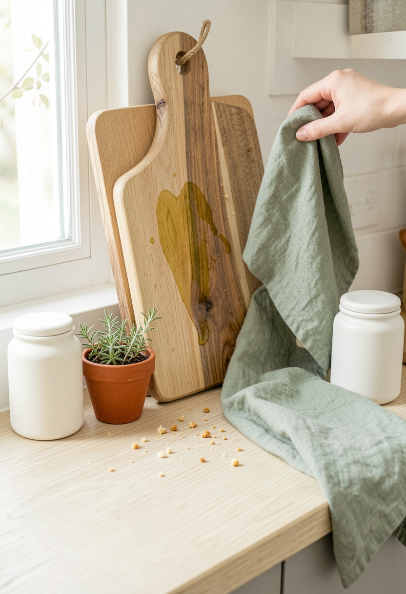
Once your foundation is set, warm woods and textiles make a neutral tile feel lived-in and timeless.
Place a large acacia cutting board (tall enough to reach two-thirds of your backsplash height) leaning against the counter to connect vertical surfaces to the floor.
Helpful links: Acacia wood cutting board 18×12 and Sage linen dish towels set of 4.
The visual principle here is texture contrast: smooth tile plus warm wood softens the room and hides slight color shifts as light changes.
Mistake: matching wood tones exactly to cabinets. That creates a flat look. Instead, layer a slightly darker or lighter wood to create depth.
3. Add Height and Drama with Open Shelving
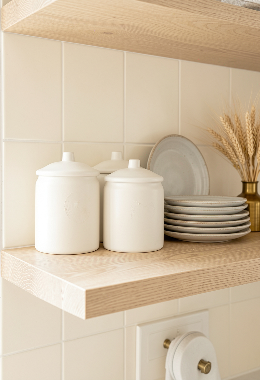
Open shelving pulls the eye up so the floor reads as part of a layered whole, not a standalone statement.
Keep shelf spacing about 16 to 20 inches above the counter so the shelf feels connected but not crowded. Group items in odd numbers and vary height.
Style with Matte white ceramic canister set with acacia wood lids and Acacia wood floating shelf 24 inch.
Visual principle: vertical balance reduces the chance a bold floor trend will dominate. If a floor color begins to feel dated, the eye still moves upward to the curated shelf vignette.
Mistake: overcrowding shelves with small objects. It competes with the floor. Edit to three to five well-spaced pieces.
4. Create Ambiance with Warm Diffused Lighting
Lighting changes how tile reads more than anything else. Warm light softens cool tile; cool light emphasizes blue undertones.
Install warm under-cabinet lighting and pair with a soft pendant over the island for layered glow.
Links: Warm white under cabinet LED strip and Rattan pendant light 15 inch.
The visual principle: color temperature shifts perceived undertone. Test tiles under the warm bulbs you’ll use at night before deciding.
Mistake: choosing only cool, bright LEDs to “show off” tile. That often makes warm greiges read off and aged.
Common Styling Mistakes to Avoid
Mistake: Picking pure bright white tile because it looks timeless
Why it doesn't work: White shows grime and often reads cold in warm kitchens.
Do this instead: Choose a warm greige or soft gray Porcelain tile sample 12×24 gray to test.
Mistake: Matching wood floors exactly to cabinets
Why it doesn't work: Creates a flat, dated aesthetic.
Do this instead: Layer a different wood tone like acacia cutting board Acacia wood cutting board 18×12.
Mistake: Buying tile without checking it under evening light
Why it doesn't work: Undertones shift after dark and with warm bulbs.
Do this instead: Test tiles with your lighting using a Porcelain tile sample box 4 pack.
What You'll Need for This Look
Foundation Pieces
Porcelain tile sample 12×24 gray around $8 to $20 per sample
Calacatta quartz sample approx $0 to $25 (many are free)
Matte black cabinet pulls 3 inch around $10 to $30 per set
Textiles & Soft Goods
Sage linen dish towels set of 4 around $18 to $35
Sisal natural fiber kitchen rug 2×6 around $40 to $120
Lighting
Warm white under cabinet LED strip approx $15 to $50
Rattan pendant light 15 inch around $60 to $180
Finishing Touches
Matte white ceramic canister set with acacia wood lids around $35 to $50
Acacia wood floating shelf 24 inch approx $30 to $80
Small terracotta herb pot 4 inch around $6 to $18
Budget Swaps
Porcelain tile sample box 4 pack cheaper than full boxes, around $10 to $30 (thrift large offcuts at Habitat Restore)
Shopping Guide for This Look
Buy samples first: Order tile and countertop samples, see them at night with your fixtures. Porcelain tile sample 12×24 gray approx $8 to $20.
Thrift hack: Find vintage cutting boards and canisters at thrift stores, pair with a new Matte white ceramic canister set around $35 to $50.
2025 trend to watch: Durable, low-VOC porcelain that mimics stone remains popular; test large-format samples like Porcelain tile sample box 4 pack.
Splurge vs save: Splurge on countertop sample matching (Calacatta quartz sample), save on towels and rugs (Sage linen dish towels set of 4).
Conclusion
Start small: order two tile samples that match the undertone of your counters. Live with them for a week in morning and evening light before deciding.
One visual rule that never fails: match undertones, then layer texture. That keeps a floor looking current for years.
Which two tile samples will you try first?