How to choose blue kitchen cabinets without ending up in a dated, 10-year-old look? I learned this the hard way after picking the wrong navy for my first kitchen and watching it go flat under warm light.
The trick is picking the right undertone, pairing it with modern hardware, and layering warmth. I’ll show budget ranges from small refreshes under $200 to full updates around $2,000 and exactly what to buy.
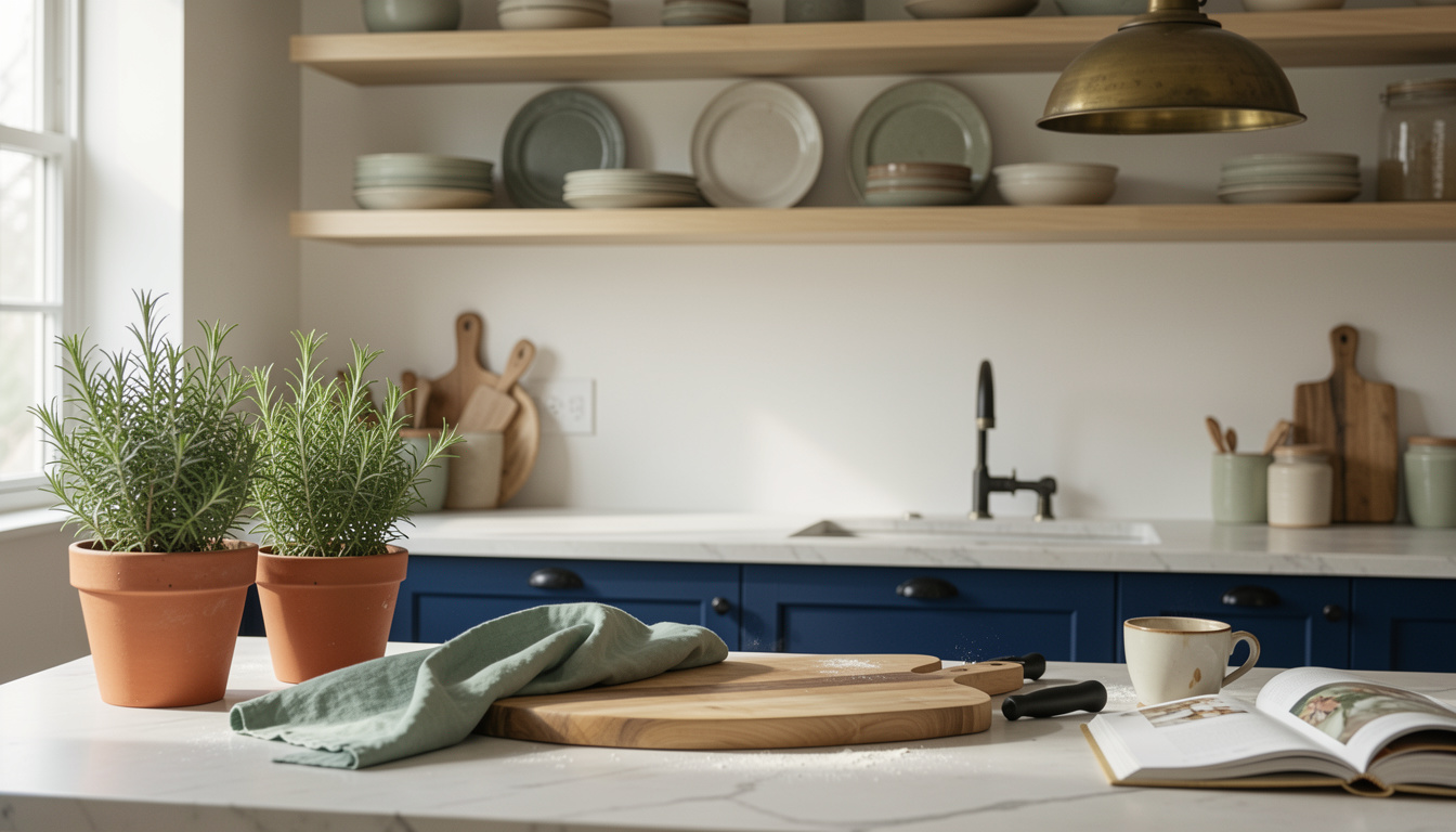
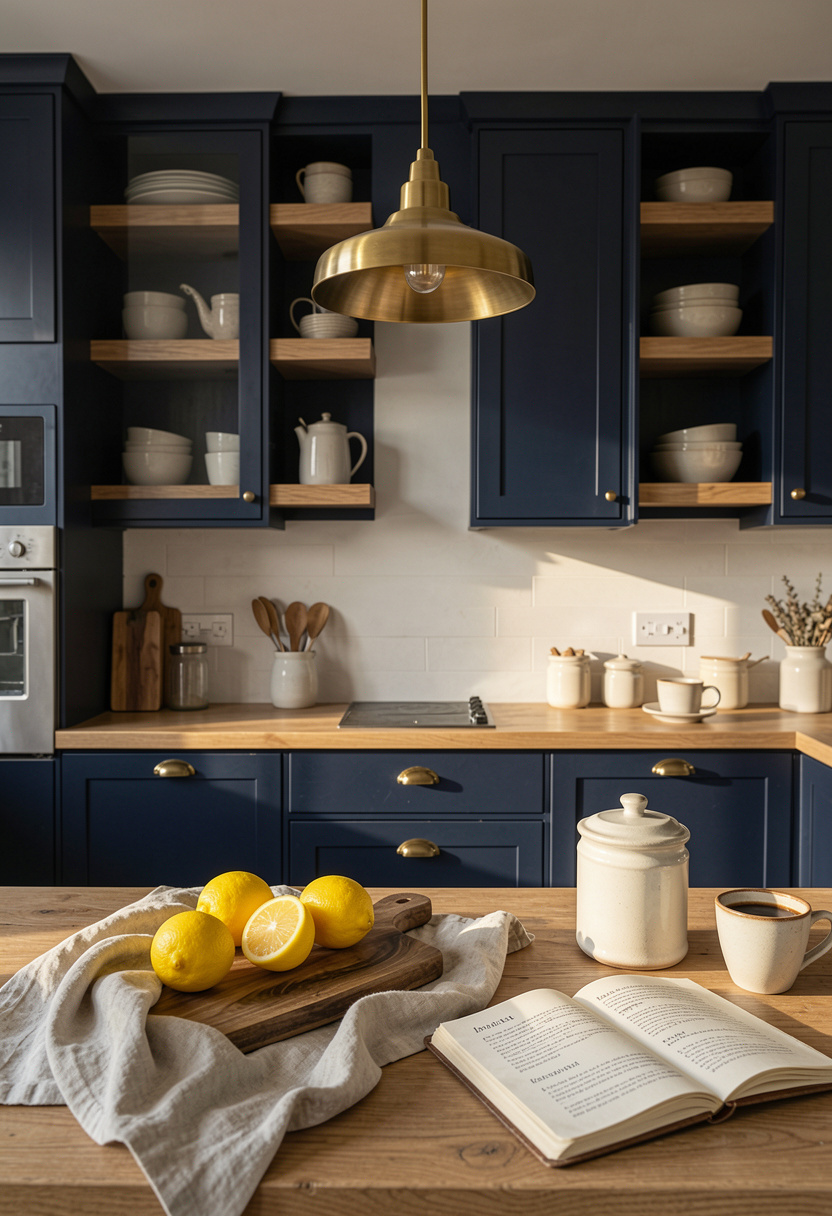
My kitchen leans modern farmhouse with coastal ease. This look suits medium to large kitchens with natural light or small kitchens that need depth.
Plan on spending around $150 to $500 for a refresh, or $1,200 to $2,500 for new hardware, shelving, and lighting. I’ve noticed more people mixing moody blue with warm wood instead of cold stainless. Also, Remodeling’s Cost vs. Value report shows kitchen updates keep strong resale value when they feel current and intentional. That’s why choices matter.
1. Start with the Foundation: Counter and Cabinet Reset
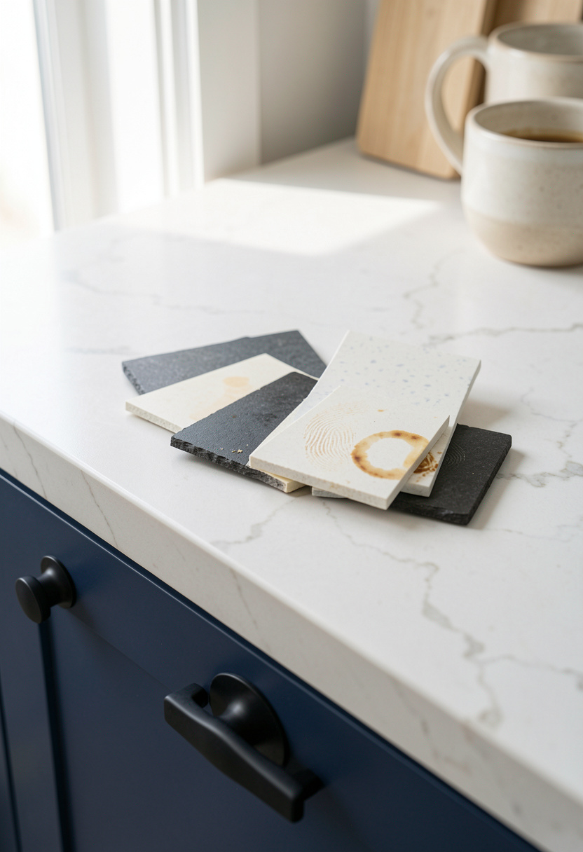
Pick a blue with a clear undertone. Cool navy with gray undertones reads modern. Navy with green undertones reads vintage. The finish matters. I prefer a low-sheen matte for cabinet doors because glossy blues age faster.
Start by upgrading hardware. Matte black bar pulls modernize blue and read crisp against warm oak counters. I swapped to Matte black bar cabinet pulls 6 inch and it made the color feel intentional.
Also get hinges that close softly. Soft close cabinet hinges full overlay stop slamming and give the kitchen a quiet, built quality.
Visual principle: contrast and edge. Dark hardware creates a clean silhouette so the blue reads modern, not retro. Common mistake: matching too many metals. Don’t mix brass, chrome, and black at once. Instead, pick one dominant finish and use another as an accent.
2. Layer Warmth with Wood and Linen Textures
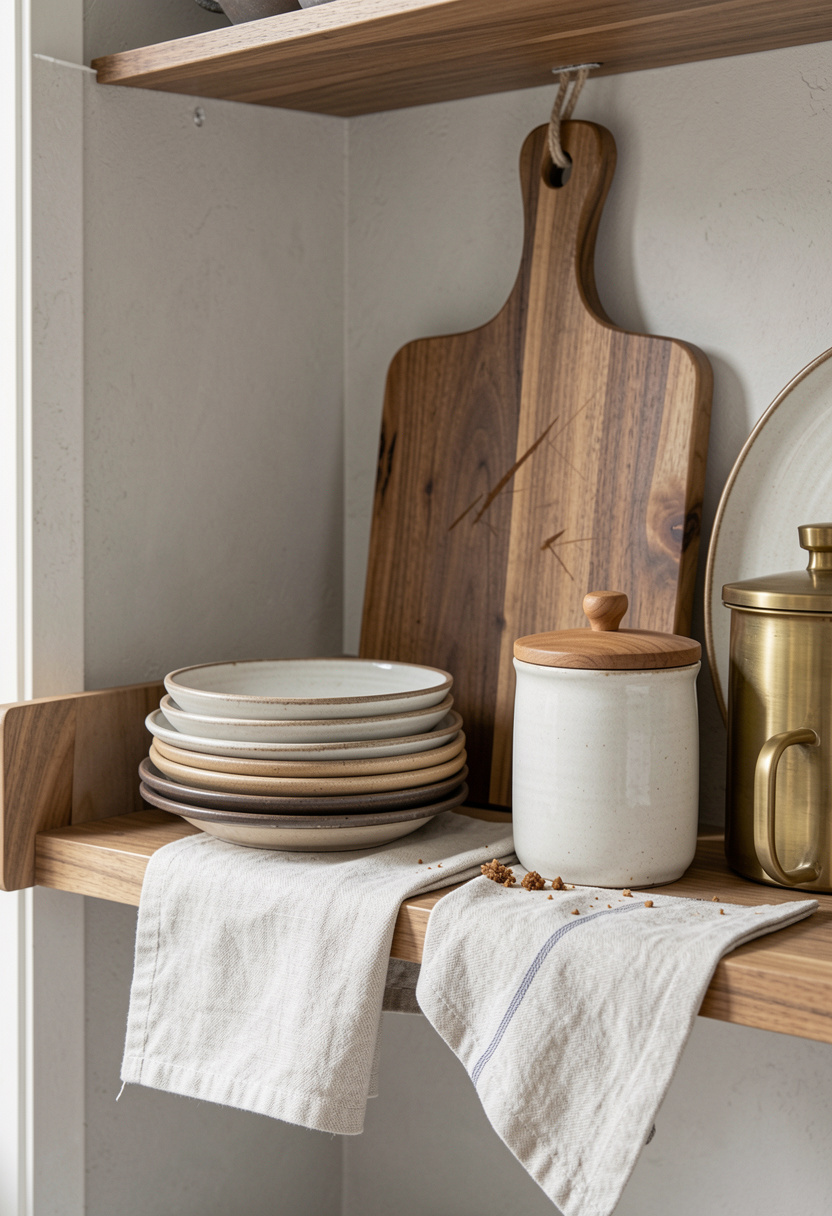
Blue cabinets can feel cold. Layer warm wood and soft linen to make the color feel timeless. I mounted a 24-inch acacia shelf above my counter to add warmth and break up the blue field.
For quick warmth add a Large acacia cutting board 20×15 and a Matte white ceramic canister set with acacia wood lids. The natural grain offsets navy and keeps the look from feeling flat.
Principle: temperature balance. Warm textures pull blue into a curated, lived-in palette. A mistake I made: using a thin board that vanished visually. Go big with one large wood piece and two smaller items. Aim for a 60/30/10 mix of materials across the counter.
3. Add Height and Drama with Open Shelving
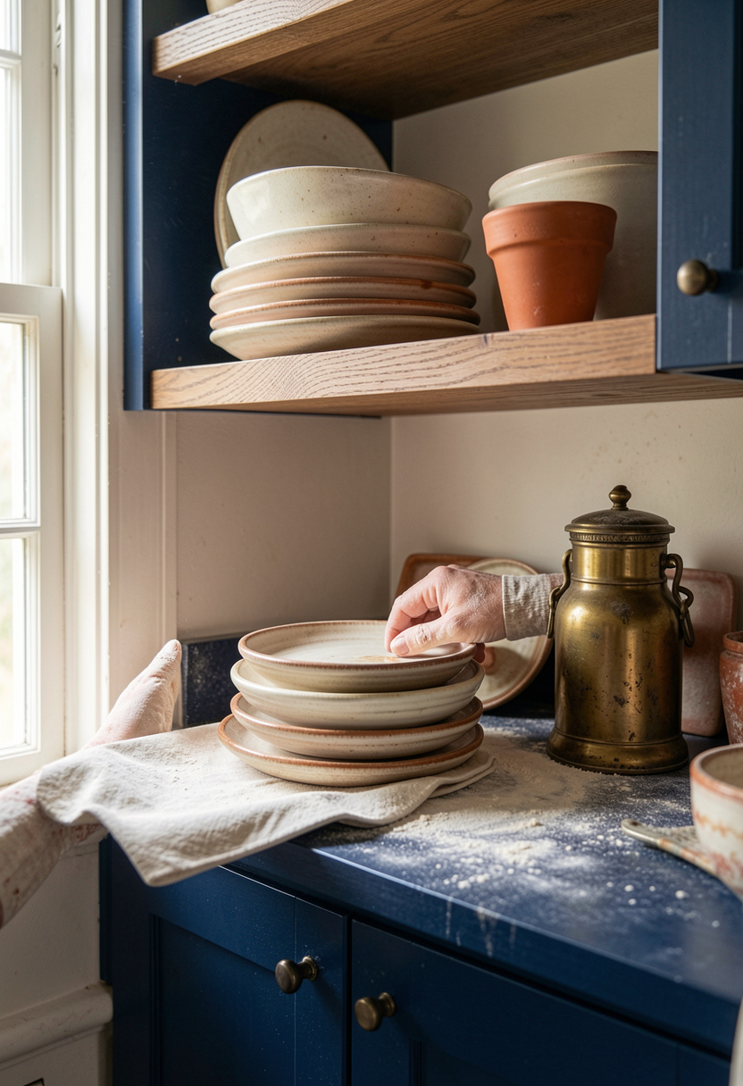
Open shelving creates vertical interest and prevents blue from feeling boxed in. Place shelves 16 to 20 inches above the counter so they sit comfortably between backsplash and height of upper cabinets.
Use odd numbers. Stack three stoneware plates, add two glass jars, then a small brass accent. I use Floating shelf brackets heavy duty 12 inch for a near-seamless look.
Visual principle: rhythm and scale. Vary heights and shapes so the eye moves. What doesn’t work: overcrowding shelves. One tidy vignette every 24 to 30 inches reads calm. If you must display more, rotate items seasonally.
4. Create Ambiance with Warm Diffused Lighting
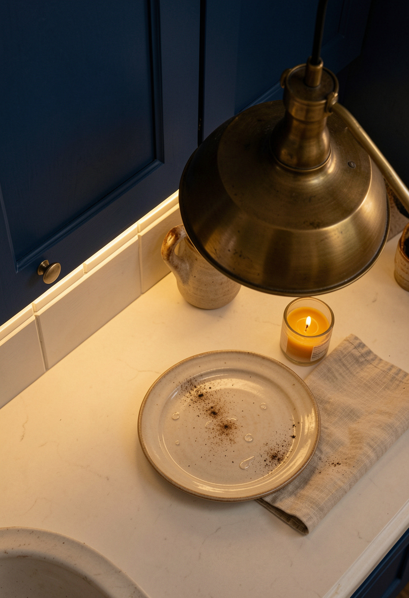
Lighting changes how blue reads more than paint samples do. I swapped cold bulbs for warm 2700K LEDs and the navy looked richer instantly.
Under-cabinet strips for task light and a single aged brass pendant for mood work best. I installed Warm white under cabinet LED light strip and a focal Aged brass pendant light 15 inch.
Principle: layered light. Ambient, task, and accent create depth. Don’t light everything bright white. Ugly truth: a pretty cabinet color can read cheap under harsh cool light. Swap the bulb first before blaming the paint.
Common Styling Mistakes to Avoid
Mistake: Picking blue from a tiny paint swatch
Why it doesn't work: Undertones shift in room light and look wrong at scale.
Do this instead: Try a Matte navy cabinet paint sample kit on a full door, not a square.
Mistake: Using three different metal finishes randomly
Why it doesn't work: Visual clutter and a disjointed palette.
Do this instead: Choose one metal for hardware and one accent. I used Brass cabinet knobs 1 inch as accents.
Mistake: Over-styling open shelves with matching pieces
Why it doesn't work: The shelf reads staged and dated.
Do this instead: Mix materials and odd numbers. Start with Stoneware dinner plates set of 4.
What You'll Need for This Look
Foundation Pieces
Quartz countertop sample kit around $25 to $60
Matte black bar cabinet pulls 6 inch approx $20 to $45 for 10
Large acacia cutting board 20×15 around $25 to $60
Textiles & Soft Goods
Sage linen dish towels set of 4 approx $18 to $35
Jute runner rug 2×6 around $30 to $80
Sage linen curtains 52×84 around $25 to $70
Lighting
Warm white under cabinet LED light strip approx $20 to $50
Aged brass pendant light 15 inch around $60 to $180
Finishing Touches
Matte white ceramic canister set with acacia wood lids around $35 to $50
Stoneware dinner plates set of 4 approx $25 to $60
Ceramic herb planters set of 3 around $20 to $40
Budget Swaps
Acacia floating shelves 24 inch similar at TJ Maxx for less
Floating shelf brackets heavy duty 12 inch lower-cost thrift frames work too
Shopping Guide for This Look
Pick undertone first: Test navy swatches in morning and evening light with a Matte navy cabinet paint sample kit.
Thrift hack: Hunt for wood cutting boards and brass vessels at flea markets then pair with new Matte white ceramic canister set for cohesion.
2025 trend pick: Mix warm wood with moody blue for longevity; add a Large acacia cutting board 20×15 now.
Splurge vs save: Splurge on hardware and lighting like Aged brass pendant light 15 inch, save on textiles and planters.
Conclusion
Start with one high-impact change. For me it was swapping hardware and adding a single large acacia board. That small step made my blue feel chosen, not accidental.
One principle to keep: balance cool color with warm material and layered light. Which element will you try first: paint, hardware, or shelves?