Choosing kitchen cabinet colors can feel big. The right combination creates a balanced, personal space. It sets the mood for your whole kitchen. These ideas mix classic and modern styles. You can find a look that fits your home. Many options work with simple updates. A small change in color makes a large difference.
1. Classic White & Navy Blue

This pairing is a forever favorite. White keeps the space feeling open and light. Navy blue adds a strong, grounding element. It feels both traditional and current. The high contrast is easy on the eyes. Try painting just your island for a similar effect. This is a simple DIY project. Use sample pots to test the colors on a cabinet door first. Good lighting makes both colors shine.
2. Charcoal Gray & Warm Wood Tones

Charcoal gray is a powerful neutral. It pairs beautifully with the organic feel of wood. Wood open shelves or a butcher block countertop introduce warmth. This stops the gray from feeling cold. The combination is very durable and practical. Update hardware to brushed brass for a budget-friendly lift. You can also stain existing wood elements a shade warmer to enhance the contrast.
3. Sage Green & Crisp White

Sage green brings a calm, natural vibe to your kitchen. It works like a neutral but with more character. Crisp white keeps everything feeling clean and spacious. This is a very relaxing color scheme. It works in both modern and farmhouse styles. Paint your pantry door the same sage green for a cohesive look. This is a small, low-cost project with big visual impact.
4. Dual-Tone Blue & Green Harmony

Why choose between blue and green? Using both creates a custom, layered look. Select tones that have the same intensity. A soft seafoam and a dusty blue work well together. This approach adds depth without being overwhelming. Use a color wheel to find shades that live next to each other. This DIY designer trick ensures harmony. Keep walls and counters neutral to let the cabinets stand out.
5. Bold Black & Brass Accents

Black cabinets make a strong style statement. They create a sense of sophistication and depth. Brass hardware and fixtures add a warm, glowing contrast. This combination feels both classic and very now. To keep it from feeling too dark, ensure you have good task lighting. Swapping out hardware is an easy update. Look for brass knob and pull sets to instantly change the cabinet’s personality.
6. Warm Terracotta & Cream
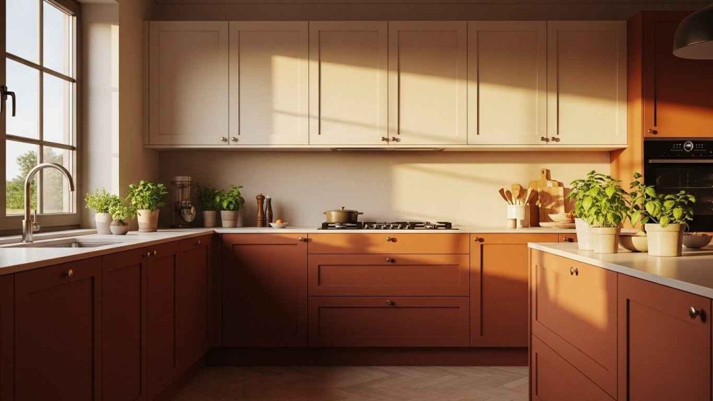
Terracotta brings a wonderful, earthy warmth to a kitchen. It feels friendly and lived-in. Cream is a softer alternative to bright white. It complements the terracotta without competing. This palette is perfect for a cozy, Mediterranean-inspired space. A terracotta paint color on an island can introduce this warmth without a full kitchen commitment. It’s a manageable weekend project.
7. Sophisticated Gray Two-Tone

A two-tone scheme using different shades of gray is effortlessly chic. It adds visual interest while maintaining a monochromatic feel. The lighter color on top keeps the room feeling airy. The darker base grounds the design. This is a very flexible approach. Use two shades from the same paint strip. This guarantees the tones work together perfectly. It’s a simple designer secret for a cohesive look.
8. Navy Blue Lower, White Upper

This is a specific take on the two-tone trend. It is practical and stylish. The dark color on the bottom hides scuffs and spills. The white on top reflects light and makes the ceiling feel higher. This layout is very balanced and easy to live with. Paint your lower cabinets only to achieve this look without a full kitchen overhaul. It saves time and money.
9. Earthy Green & Natural Wood

An earthy green, like olive or moss, connects your kitchen to nature. It is a restful and sophisticated hue. Pairing it with natural wood elements enhances this organic feel. Wood shelves or a wood range hood add texture. Consider adding floating wood shelves as a DIY project. You can stain them to match your floors or table for a pulled-together look.
10. High-Contrast Black & White
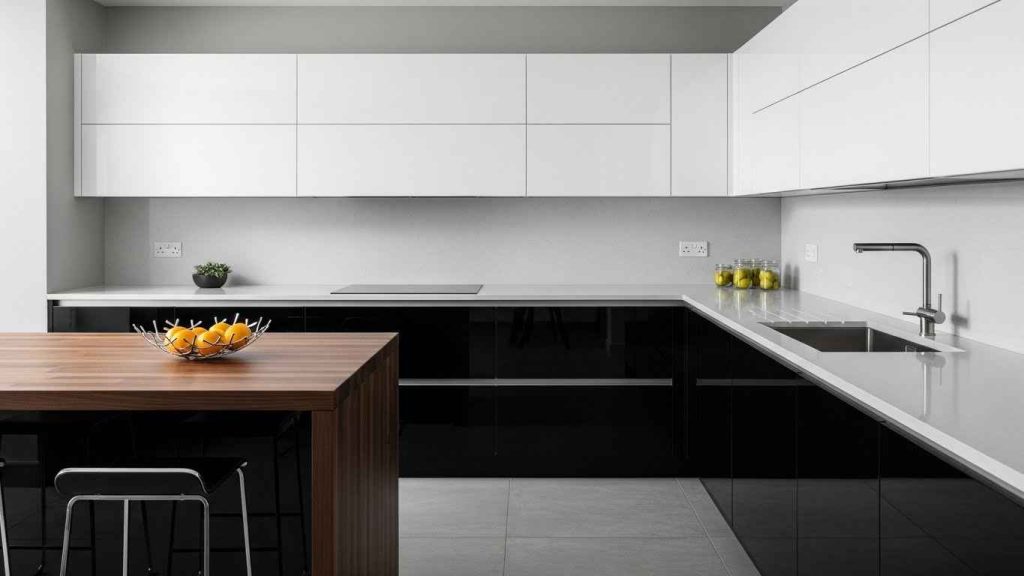
For maximum impact, this combination is a powerhouse. It is timeless, clear, and modern. Black and white create a strong graphic statement that never goes out of style. The key is balance. Use white for larger surfaces or uppers to prevent the space from feeling too heavy. Introduce a wood cutting board or a plant to soften the contrast with a natural element.
11. Soft Pastel Pink & Gray

Pastel pink is a surprisingly versatile kitchen color. It feels soft, warm, and cheerful. Cool gray provides a stable, neutral backdrop that lets the pink shine without being too sweet. This pairing is elegant and unique. Start with a pink kitchen island to test the color. If you love it, you can consider expanding the color to other cabinets later.
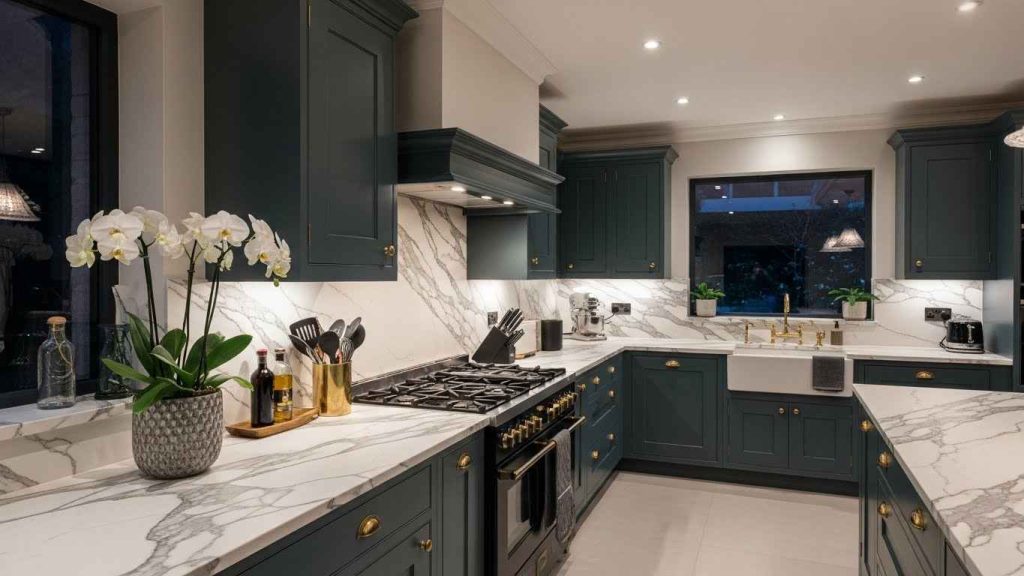
12. Deep Emerald & Gold Hardware

Deep emerald green is luxurious and bold. It creates a sense of depth and comfort in a kitchen. Gold hardware acts like jewelry, highlighting the rich color and adding a touch of glamour. This combo works well in both modern and traditional settings. Spray paint existing hardware with a gold finish for a budget-conscious way to achieve this high-end look.
13. Coastal Blue & Weathered White

This combination instantly creates a coastal, relaxed feel. The blue is reminiscent of the sea and sky. Weathered white has a vintage, washed-out quality that feels soft and inviting. It avoids the crispness of pure white. Distress a white cabinet or shelf yourself using sandpaper. Focus on the edges and corners to mimic natural wear and tear for a custom look.
14. Warm Honey & Cool Slate

Mixing warm and cool tones creates a dynamic and balanced space. Warm honey wood feels inviting and traditional. A cool slate gray on a backsplash or island provides a modern counterpoint. This balance keeps the room from feeling too one-note. A slate-look tile can be a cost-effective way to introduce this cool element. It’s durable and easy to clean.
15. Vibrant Yellow & Neutral Gray

Yellow brings instant sunshine and energy into a kitchen. Using it on an island creates a focal point without overwhelming the space. Neutral gray cabinets provide a calm, modern base that lets the yellow pop. This is a great way to incorporate a bold color. A gallon of yellow paint is often enough for an island, making this a very affordable color update.
16. Rich Burgundy & Light Oak

Burgundy is a deep, dramatic color that feels rich and cozy. It works surprisingly well in a kitchen, especially when balanced with light wood. Light oak open shelves or uppers keep the space from feeling too heavy. The wood adds a natural texture. Refinish existing oak cabinets with a light stain to achieve this look. It brightens the wood and lets the burgundy stand out.
17. Monochromatic Gray Palette

A monochromatic gray scheme is calm and sophisticated. Using different shades and textures of gray adds depth and prevents the look from feeling flat. Think matte cabinets, a glossy backsplash, and a textured countertop. This approach is very forgiving and easy to style. Add different textures through textiles like a woven runner rug. This is a simple way to build visual interest.
18. Serene Sky Blue & White

Sky blue is a light, happy color that makes a kitchen feel expansive and fresh. It is much softer than navy but still provides a clear color statement. Paired with white, it feels clean and timeless. This is a wonderful choice for smaller kitchens. Paint your cabinet interiors white to create a surprise of brightness every time you open a door.
19. Dramatic Dark Teal & Marble
Dark teal is a unique alternative to black or navy. It has a rich, complex quality. White marble with gray veining connects the dark cabinets to the lighter elements in the room. The veining often picks up the teal tone, tying everything together. Use marble-look contact paper on a countertop or backsplash for a fraction of the cost. It’s a temporary change you can do yourself.
20. Sunny Yellow & Navy Blue

This is a classic, high-energy color pairing. Yellow and blue are opposites on the color wheel, which makes them naturally balanced. The yellow feels optimistic, while the navy is steadying. It’s a fun, retro-inspired look. Use this combo in a small pantry or mudroom to experiment with the bold pairing before applying it to the entire kitchen.
21. Warm Beige & Espresso Brown

This is a tonal, neutral scheme that feels incredibly warm and inviting. Beige has evolved into sophisticated greige and taupe shades. Espresso brown is a deep, rich neutral. Together, they create a cozy, cocoon-like effect. This palette is very easy to live with. Stain wood trim or furniture to match the espresso brown cabinets. This helps to unify the room’s elements.
22. Muted Olive & Black Accents

Muted olive is a sophisticated green that works as a neutral. It is less bright than sage and has more gray in it. Black accents, like hardware and faucets, add definition and a modern edge. This combination feels both natural and structured. Paint an old piece of furniture in the same olive tone to use as a kitchen cart or island. It adds character and function.
23. Cool Light Gray & Dark Wood

Light gray cabinets offer a clean, modern backdrop. They make a kitchen feel bright and spacious. Dark wood floors provide a strong, grounding element that adds warmth and contrast. This balance prevents the room from feeling too cold or too heavy. A dark wood stain can transform existing floors or a wooden island to create this appealing contrast.
24. Two-Tone Island Contrast

Making your island a different color is a popular and effective strategy. It defines the space and creates a natural focal point. You can use a bold color on the island with neutral perimeter cabinets, or vice versa. This is a great way to incorporate trend colors without a full commitment. This is one of the easiest cabinet painting projects because it involves a single, freestanding unit.
25. Playful Mint & Charcoal

Mint green is a retro color that feels fresh and playful in a modern context. It is light and bright. Charcoal gray walls provide a dramatic, modern background that makes the mint cabinets stand out. This combo is unexpected and lively. Use mint for open shelving backs to add a subtle pop of color that is visible but not overwhelming.
26. Deep Indigo & White Uppers

Deep indigo is a rich, almost black blue that feels very deep and serene. It is less stark than pure black. White uppers keep the space from feeling too dark and help reflect light. This is a sophisticated and cozy combination. Choose a satin or eggshell finish for the indigo to add a soft sheen that catches the light beautifully.
Start with one small change. Paint a single cabinet door to see how the color looks in your light. A new color can change the whole feeling of your kitchen. You do not need to do everything at once. Find a combination that makes you happy to walk into the room.