A modern kitchen color palette creates a space that feels both current and comfortable. It is about choosing colors that work together in a simple, intentional way. The right combination can make your kitchen a place you love to spend time in. These ideas show how color can shape the feel of your entire kitchen.
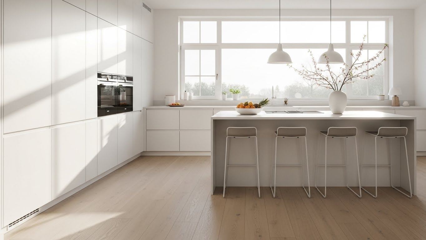
1. The All-White Sanctuary
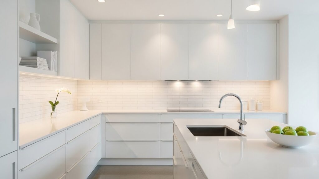
An all-white kitchen feels clean and expansive. It makes a small room appear larger. Use different textures to keep it from feeling flat. Think of a matte cabinet finish next to a glossy tile backsplash. Add warmth with wood cutting boards or a simple woven basket. Paint is a budget-friendly way to achieve this look. You can refresh your existing cabinets with a bright white semigloss paint.
2. Charcoal and Crisp White
This palette creates a strong, defined look. The dark lower cabinets anchor the space while the white uppers keep it feeling light. It is a practical choice for busy kitchens. Consider a charcoal island for a focal point. Try a two-tone approach without a full remodel. Paint just your island a deep charcoal gray to test the style. Pair it with your existing white walls and countertops.
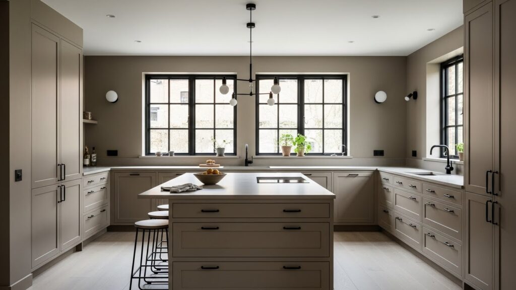
3. Warm Greige Harmony
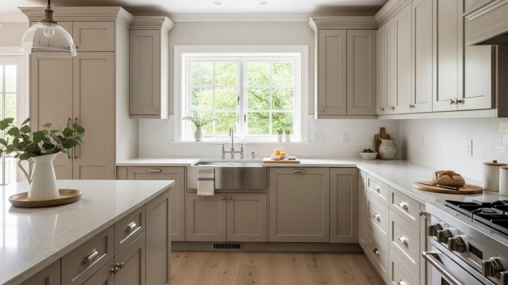
Greige is a mix of gray and beige. It offers the coolness of gray with the warmth of beige. This color works with almost any accent. It pairs well with both silver and brass hardware. The result is a kitchen that feels soft and welcoming. Use greige on your walls for an easy color update. It is a neutral that adapts to your changing decor.
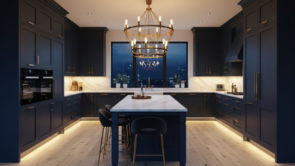
4. Navy Blue Elegance
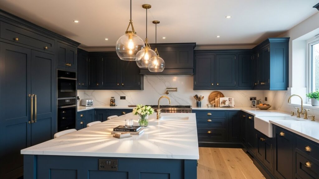
Navy blue brings a sense of depth and classic style. It feels formal yet remains very livable. Lighter countertops and hardware in brass or polished nickel prevent the space from becoming too dark. You do not need to commit to all navy cabinets. Create an accent with paint. A single navy blue wall or a painted pantry door adds a touch of drama without overwhelming the room.
5. Sage Green Serenity
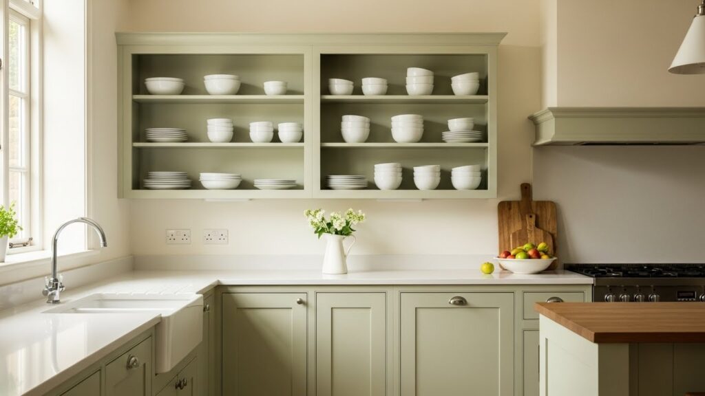
Sage green is a soothing, earthy color. It connects your kitchen to the outdoors. This muted green works beautifully with natural wood tones and white countertops. It creates a relaxing environment for cooking and gathering. For a simple DIY project, paint your lower cabinets sage green. Leave the uppers white or as open shelves to maintain an airy feel.
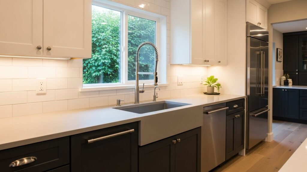
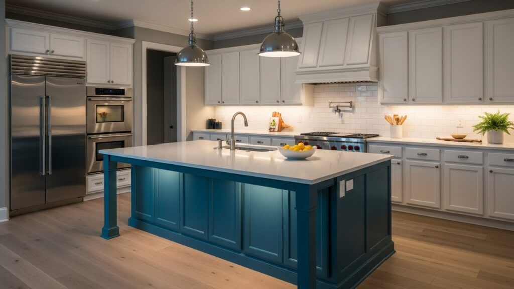
6. Two-Tone Cabinet Drama
Two-tone cabinets add visual interest and break up a block of color. A common approach is a darker color below and a lighter one above. This can also help define different zones in an open-plan kitchen. You can achieve this look with paint. Choose two complementary colors from the same paint strip for a cohesive feel. This is far less costly than installing all new cabinetry.
7. Bold Black Statement
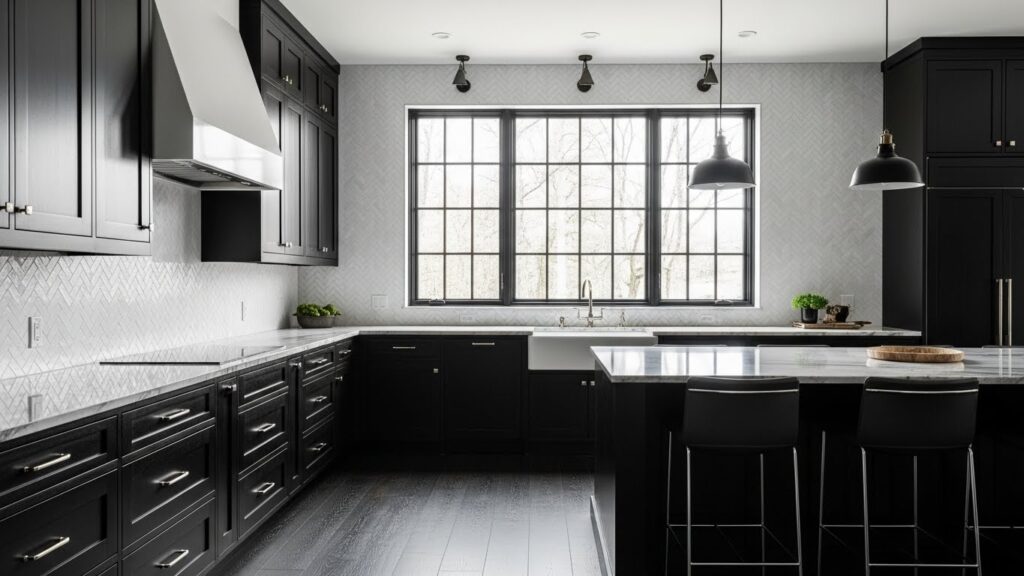
Black makes a confident and modern statement. It feels sleek and timeless. To keep it from feeling heavy, incorporate plenty of light. Use reflective surfaces like a glass tile backsplash or a polished concrete floor. Good task lighting is essential. Start small with black accents. Switch out your hardware to black or add a black stainless steel appliance before painting entire cabinets.
8. Coastal Blue & White
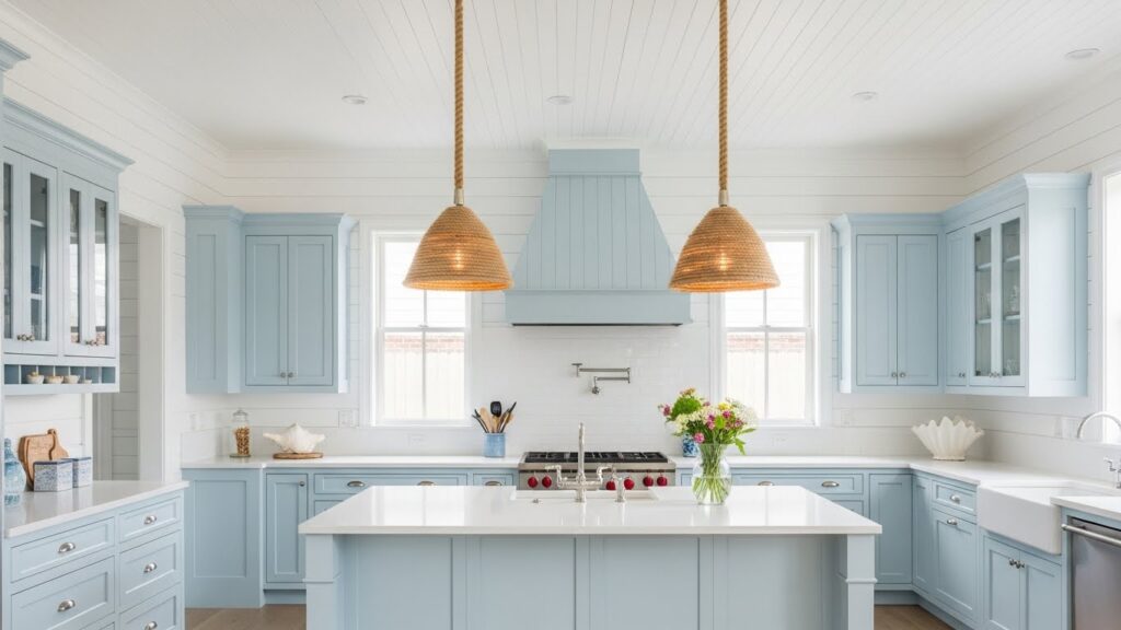
This palette evokes a relaxed, coastal feeling. It is light, airy, and always feels sunny. Think of soft sky blue paired with crisp white. Natural materials like rattan or seagrass enhance the theme. You can bring in the theme with textiles. Add blue and white striped dish towels or a simple runner rug. These small touches are easy to change with the seasons.
9. Earthy Terracotta Tones
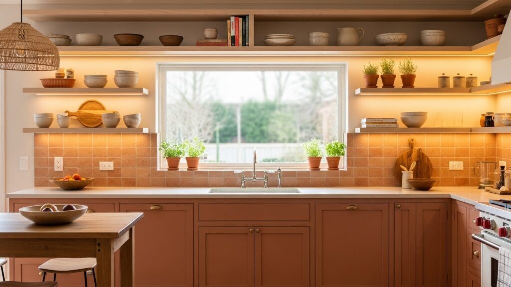
Terracotta brings a warm, Mediterranean feel to a kitchen. This rich, clay-based color pairs well with wood and black metal accents. It makes a space feel grounded and welcoming. Use it on an accent wall or on the island for a pop of warmth. Try terracotta tiles for a budget-friendly backsplash. Their handmade look adds instant character and texture.
10. High-Contrast Monochrome
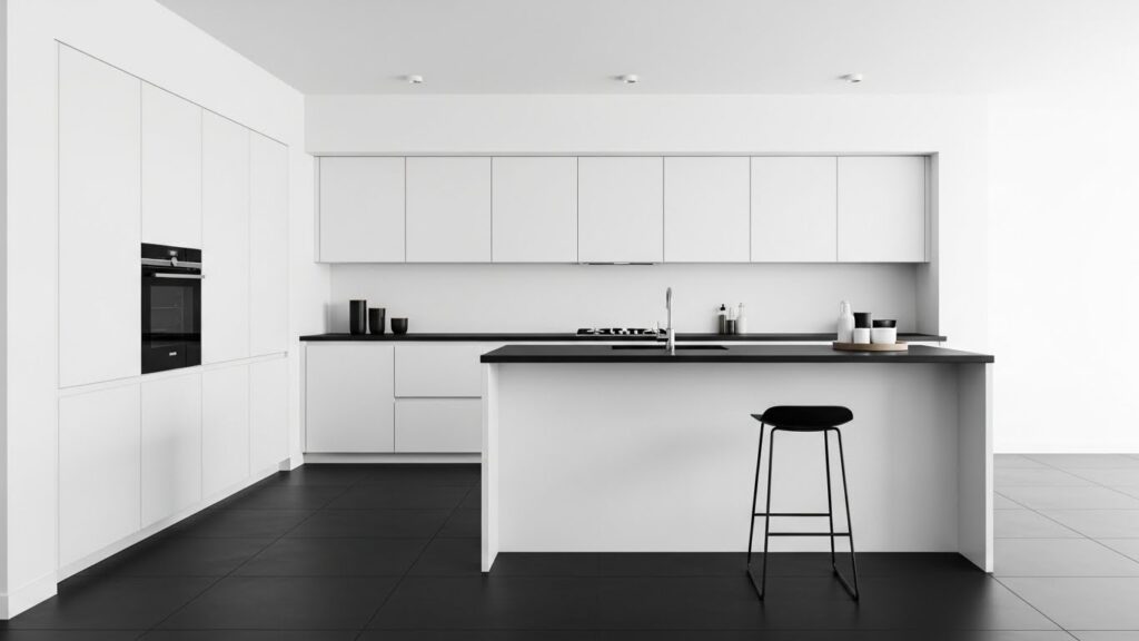
Black and white create a timeless, high-impact look. This contrast is clean and easy on the eyes. Use black for fixtures, lighting, and flooring to frame the white spaces. The key is balance. You do not want one color to dominate. Update your fixtures. Swapping out a white sink for a black one or changing your faucet to a black model can define the style.
11. Soft Pastel Accents
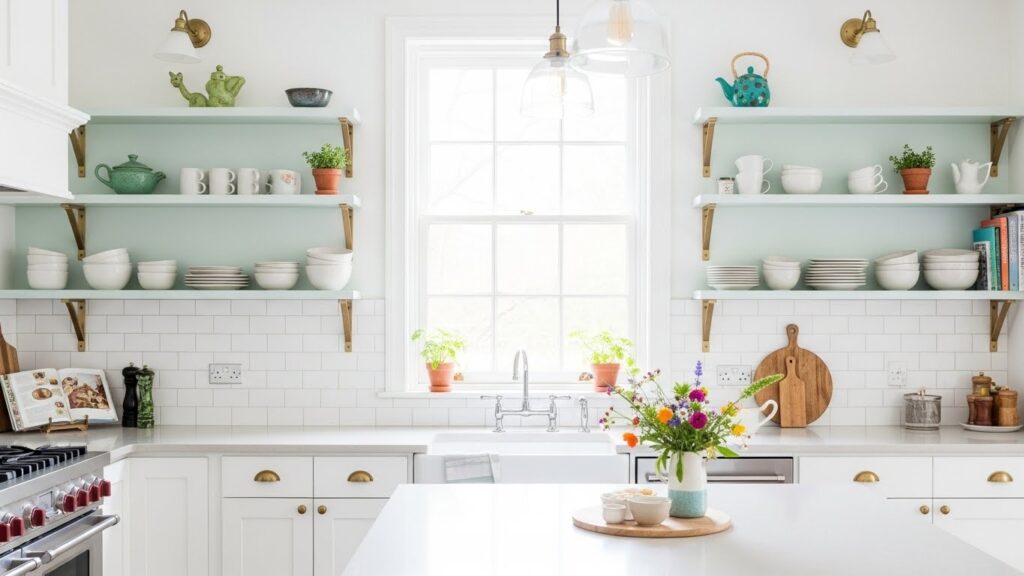
Pastels add a hint of color without being too bold. A soft mint, lavender, or pale yellow can brighten a neutral kitchen. Use these colors on a single element, like an island or open shelving. This keeps the overall feel light. Paint the inside of your cabinets a pastel color. It is a fun, hidden surprise that adds personality every time you open a door.
12. Warm Wood & Neutral
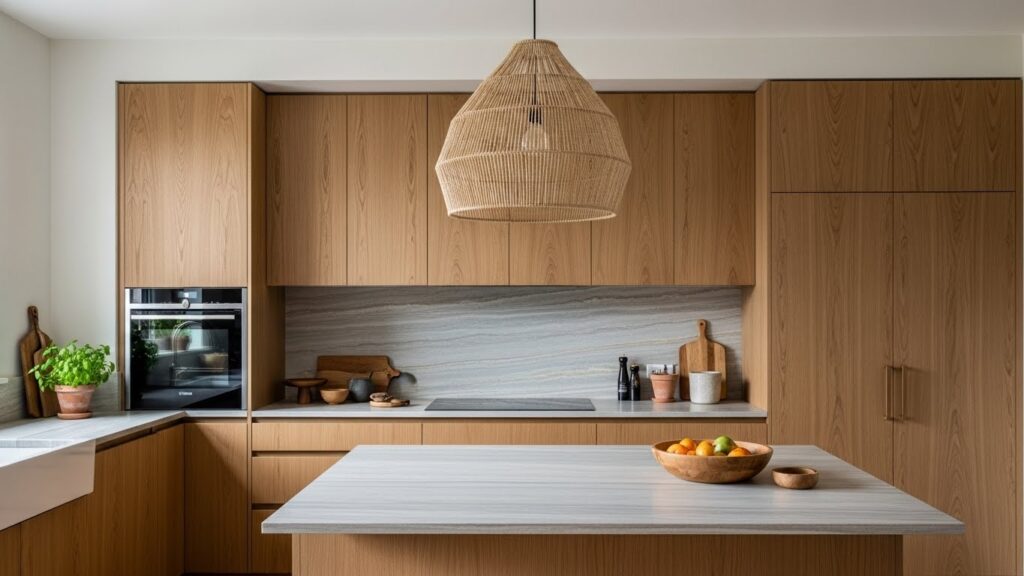
Wood cabinetry brings natural warmth and texture. It makes a kitchen feel lived-in and cozy. Pair it with neutral walls and countertops to let the wood grain stand out. This combination is enduring and easy to live with. Refinish instead of replace. If you have dated wood cabinets, consider sanding and restaining them a lighter or richer tone to modernize their look.
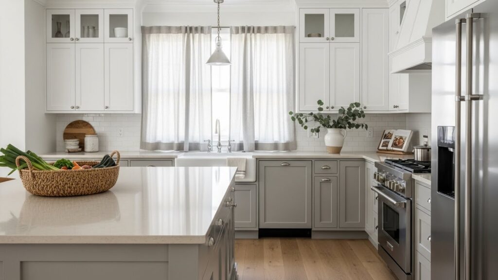
13. Cool Gray Sophistication
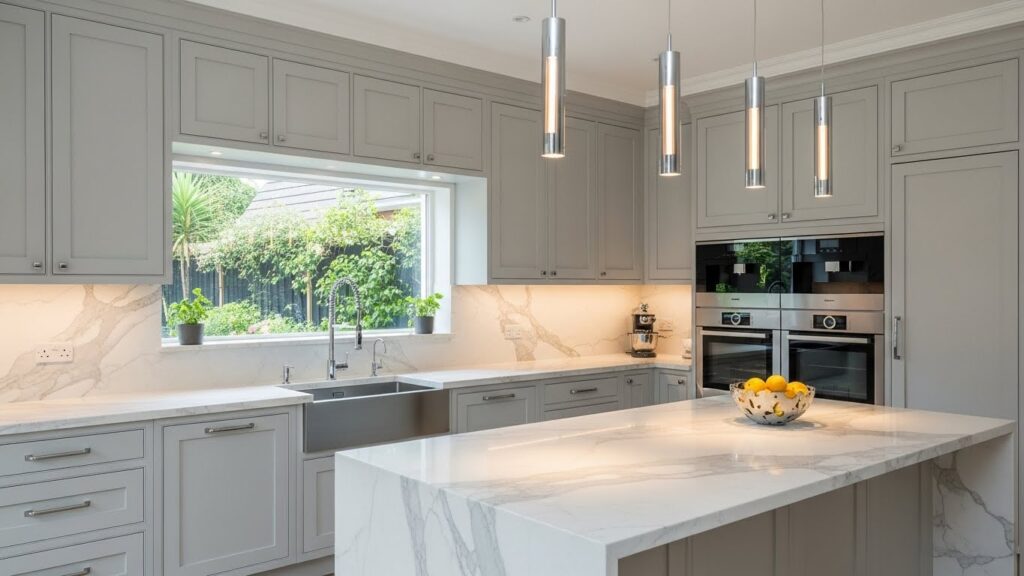
Light gray is a modern neutral that feels clean and calm. It is less stark than white and less warm than beige. This color provides a perfect backdrop for both warm and cool accents. Think stainless steel appliances or wood barstools. Use a gray tone on your walls to tie the whole kitchen together. It is a simple change that creates a cohesive, sophisticated background.
14. Sunny Yellow Uplift
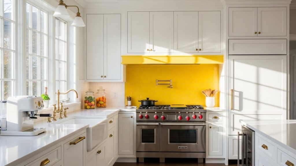
Yellow brings instant cheer and energy to a kitchen. It is a color that stimulates conversation and appetite. Use it as an accent to avoid visual overload. A yellow backsplash, small appliance, or a set of chairs can do the trick. Add a pop of color with a kettle. A bright yellow tea kettle is a functional and affordable way to introduce this sunny hue.
15. Dramatic Dark Green
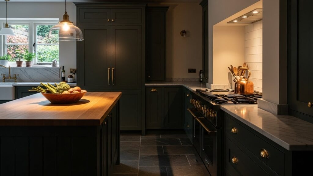
Dark green feels both natural and luxurious. It is a deep, restful color that creates an intimate atmosphere. Brass or gold hardware looks beautiful against it, adding a touch of warmth. Ensure you have good lighting to balance the depth. Paint your island a dark green. This allows you to enjoy the rich color without committing to a full set of cabinets.
16. Industrial Concrete & Metal
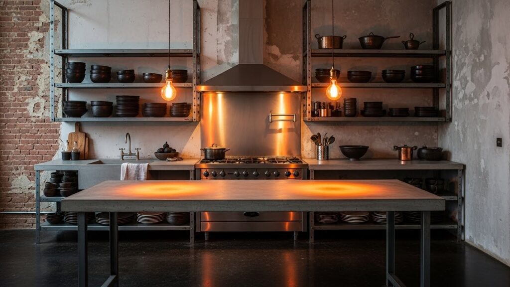
This palette uses raw materials for a utilitarian feel. Concrete, black metal, and exposed brick are common elements. The color scheme is naturally neutral and grounded. It is a durable and low-maintenance style. Use concrete-look laminate for a budget-friendly countertop option. It gives you the industrial aesthetic without the cost and weight of real concrete.
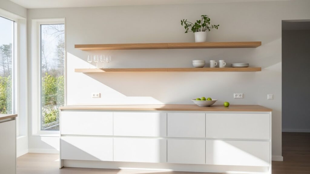
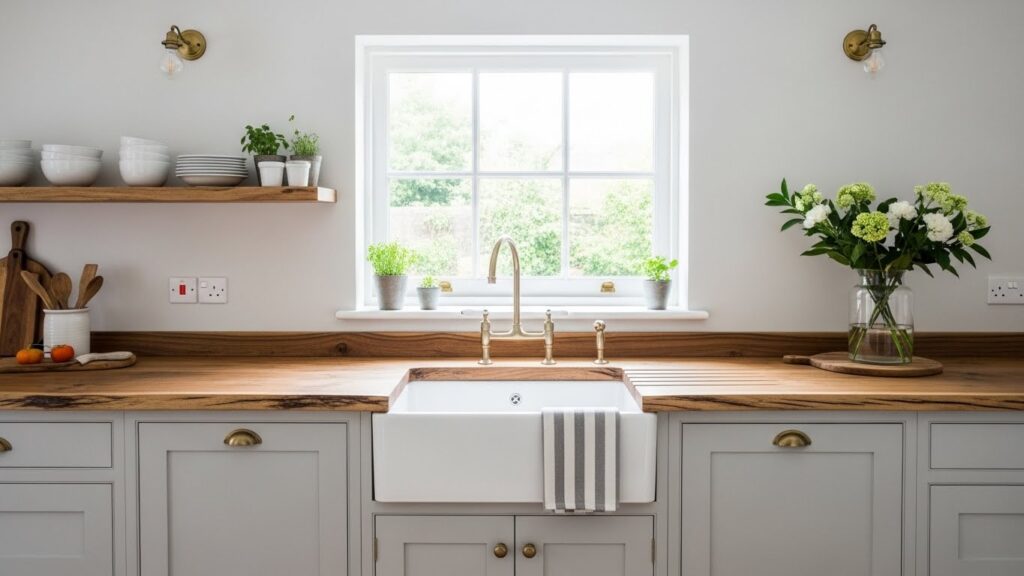
17. Creamy Off-White Comfort
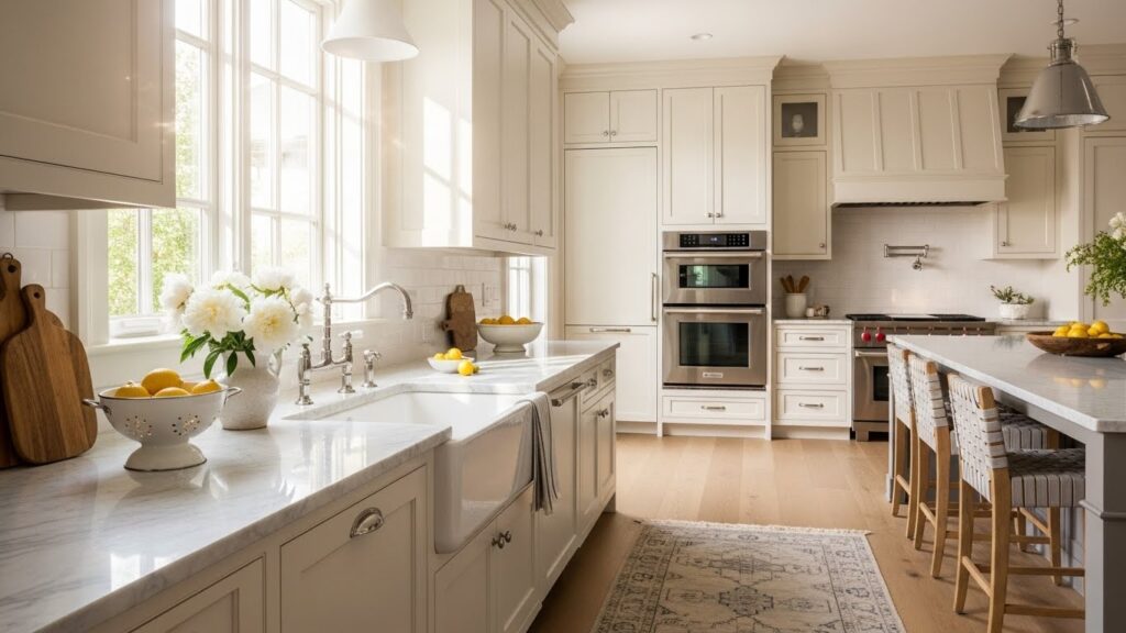
Off-white is warmer and softer than pure white. It avoids the clinical feel a bright white can sometimes have. This color makes a kitchen feel cozy and inviting. It works well in rooms with less natural light. Choose a warm white paint with yellow or beige undertones. This small shift in color temperature can make a big difference in how the room feels.
18. Blush Pink & Brass
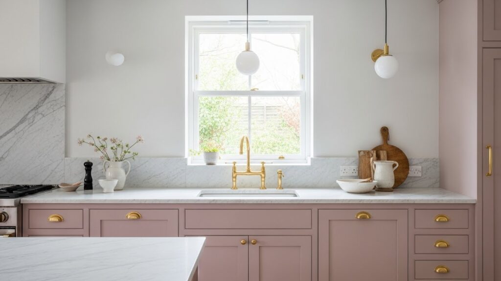
Blush pink is a subtle and sophisticated color. Paired with brass, it feels both modern and classic. This combination is warm and surprisingly neutral. It works well in a kitchen that gets soft, afternoon light. Incorporate pink with accessories. A pink stand mixer, utensil crock, or even a piece of art can introduce this trendy color in a temporary way.
19. Oceanic Teal Depth
Teal is a vibrant color with depth. It sits between blue and green, offering the best of both. It feels both retro and current. Using it on a single focal point, like an island, keeps it manageable. Try a teal backsplash. Glass or ceramic tile in this hue can become a stunning feature wall without the commitment of colored cabinets.
20. Warm Taupe & Black
Taupe is a complex neutral that works beautifully with black. The warmth of the taupe softens the starkness of the black. This creates a sophisticated and comfortable environment. It is a very adult and polished palette. Frame your windows in black. Painting your window trim black against a taupe wall is a simple DIY project that adds strong definition.
21. Vibrant Red Accent Wall
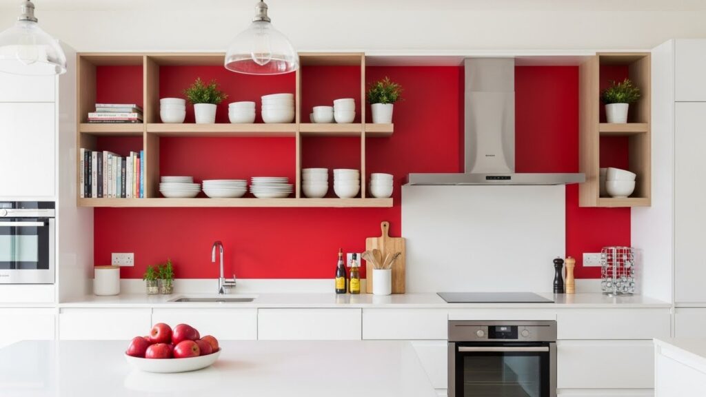
A red accent wall adds instant energy and focus. It draws the eye and can make a long wall appear closer. Use it behind open shelving to make your dishes and decor stand out. This is a high-impact, low-cost update. A single gallon of bold red paint can completely transform the dynamics of your kitchen space in just a weekend.
22. Light Oak & White
Light wood brings a sense of simplicity and nature. Paired with white, it creates a bright, Scandinavian-inspired look. The wood adds warmth and texture, preventing the white from feeling cold. Add light wood with open shelving. Installing a few light oak shelves is an affordable way to introduce this natural element and display your favorite items.
23. Moody Midnight Blue
Midnight blue is almost black but with more personality. It feels deep and cozy, perfect for creating an intimate eating nook. Pair it with light floors and countertops to maintain balance. Use this color in a well-lit room. This ensures the dark shade feels rich and inviting rather than cave-like. Good lighting is key.
24. Pale Gray & Natural Wood
This combination balances cool and warm perfectly. The pale gray provides a calm base, while the wood adds organic warmth. It is a very livable and stylish palette. Introduce wood with a cutting board. A large, beautiful wood cutting board left on the counter is a simple way to bring this natural material into your gray kitchen.
25. Sleek Stainless Steel
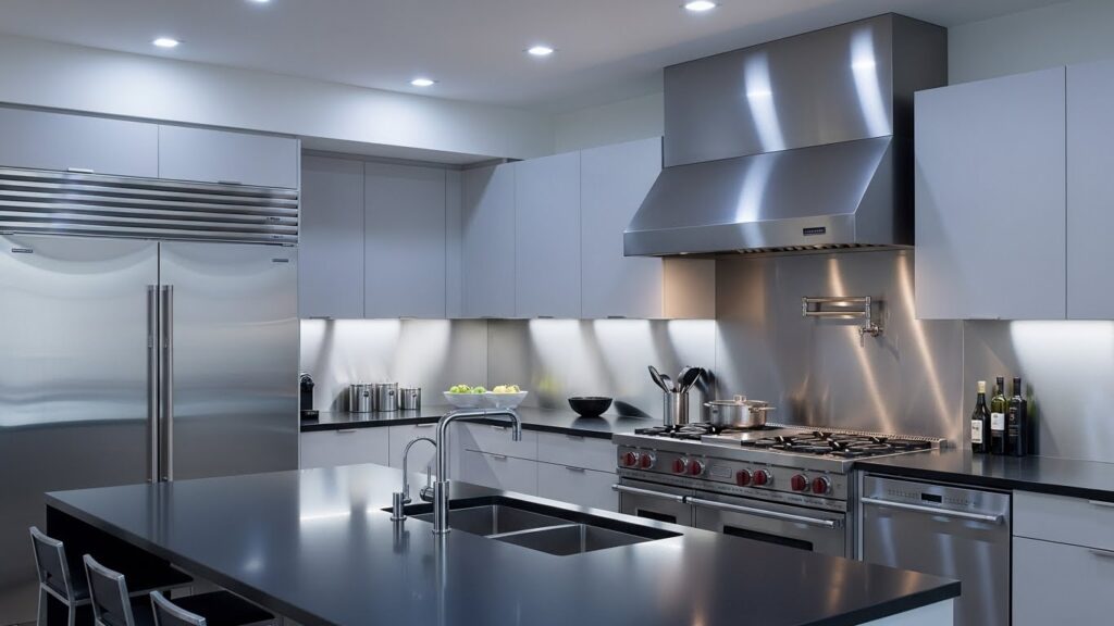
Stainless steel provides a cool, professional look. Its reflective surface helps bounce light around the room. This material is durable and easy to clean. To keep it from feeling too clinical, add warmth with wood or a colorful rug. Maintain the look easily. Use a dedicated stainless steel cleaner to keep fingerprints and smudges at bay for a consistently polished appearance.
26. The Ultimate Neutral Mix
Mixing neutrals creates a rich, layered look. Combine whites, grays, taupes, and wood tones. The trick is to stick to a similar undertone—either all warm or all cool. This prevents the palette from feeling muddy. Start with a neutral rug. A rug that combines several of your chosen neutrals can serve as a color guide for the rest of the room.
Choose one color idea that speaks to you. A small change, like a new paint color on a single wall or a set of colorful dishes, can make your kitchen feel new. Start with what you can do today.