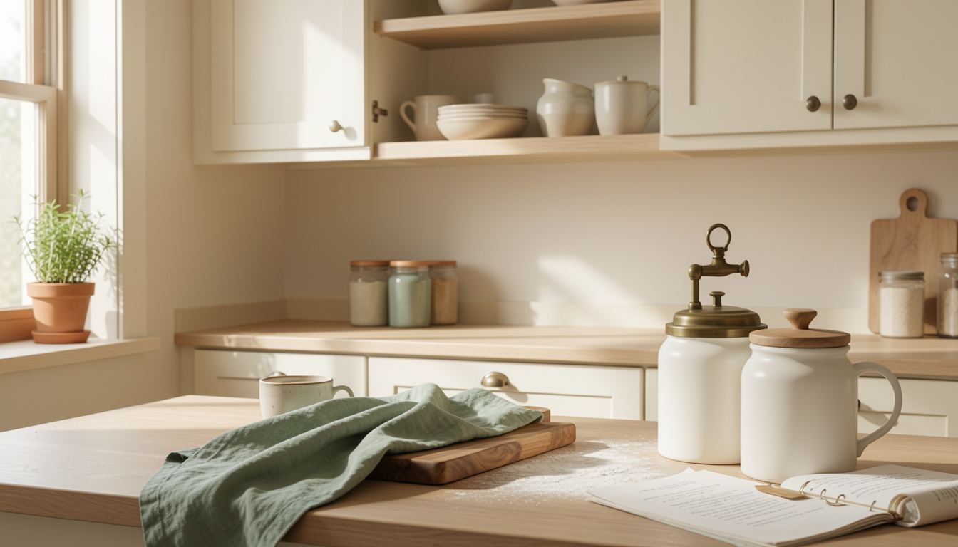
My acrylic cabinet redo got compliments for months. The trick was how to choose acrylic kitchen colors that won’t look dated next year.
I spent about $320 on paint, hardware, and a new cutting board. You’ll learn a simple order for color choices, which neutral undertones last, and where to spend versus save.
Taste here: modern farmhouse leaning toward timeless, bright kitchens. A refresh can be around $150 to $500. If you have darker counters, this approach suits you best.
Houzz report observations show neutrals still lead cabinet choices. Pinterest Predicts 2025 highlights sage and clay as rising accents I keep seeing in homes.
1. Start with the Foundation: Counter and Cabinet Reset
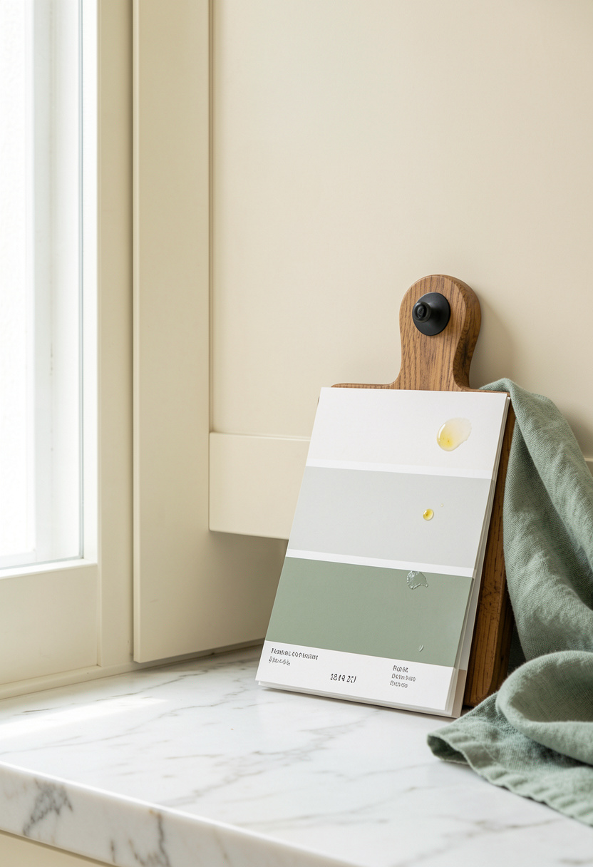
Pick the cabinet color first because it dominates the room. I chose a warm off-white with a soft yellow undertone so the cabinets read timeless rather than trendy.
For products try Acrylic cabinet paint satin off white and lock the surface with Zinsser acrylic primer. Pair with a large Acacia cutting board 20×14.
Visual principle: pick undertone over pure hue. Warm cabinets soften stainless and marble. Aim for cabinets that are one to two shades lighter than counters for contrast.
Style tip: place the shelf line 16 to 18 inches above the counter to keep sightlines balanced. Most people pick a bright white that clashes with warm quartz. Do this instead: test samples next to your countertop swatch.
2. Layer Warmth with Wood and Linen Textures
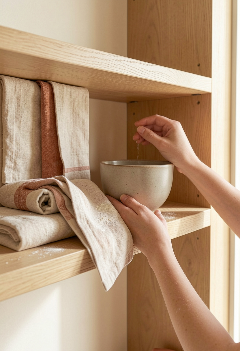
Wood tones keep acrylic colors grounded. I added a 24 inch oak shelf to warm an otherwise clinical paint job.
Shop the look with Floating oak shelf 24 inch and layer Sage linen dish towels set of 4. Finish hardware with Matte black cabinet pulls 3 inch.
Principle: texture contrast. Wood and linen break the sheen of acrylic so color reads softer over time. Place one large board vertically and two small baskets in groups of three for balance.
Common error: matching every wood to be identical. It looks staged. Mix warm oak with a darker cutting board to feel lived-in.
3. Add Height and Drama with Open Shelving
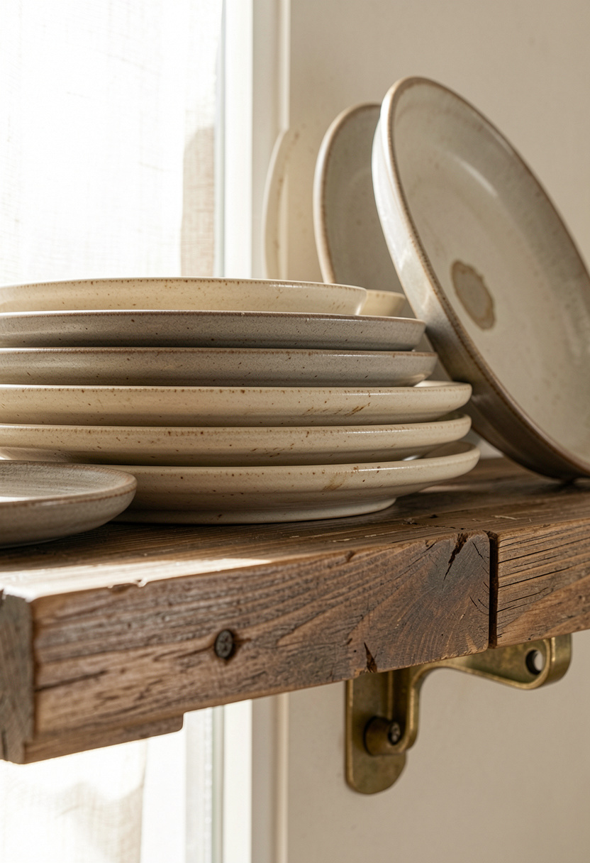
Open shelves let your acrylic color breathe. I kept the painted backsplash minimal and displayed neutral ceramics for a curated, lasting look.
Anchor pieces: Reclaimed wood floating shelf 24 inch, Brass shelf brackets small, and Neutral stoneware plates set of 6.
Visual rule: odd numbers and varied heights. Keep tallest item at the back, medium in the middle, shortest front. Shelves 18 inches above counters keep visibility open.
Mistake: overfilling shelves. It reads dated fast. Edit to 60 percent full and rotate seasonally.
4. Create Ambiance with Warm Diffused Lighting
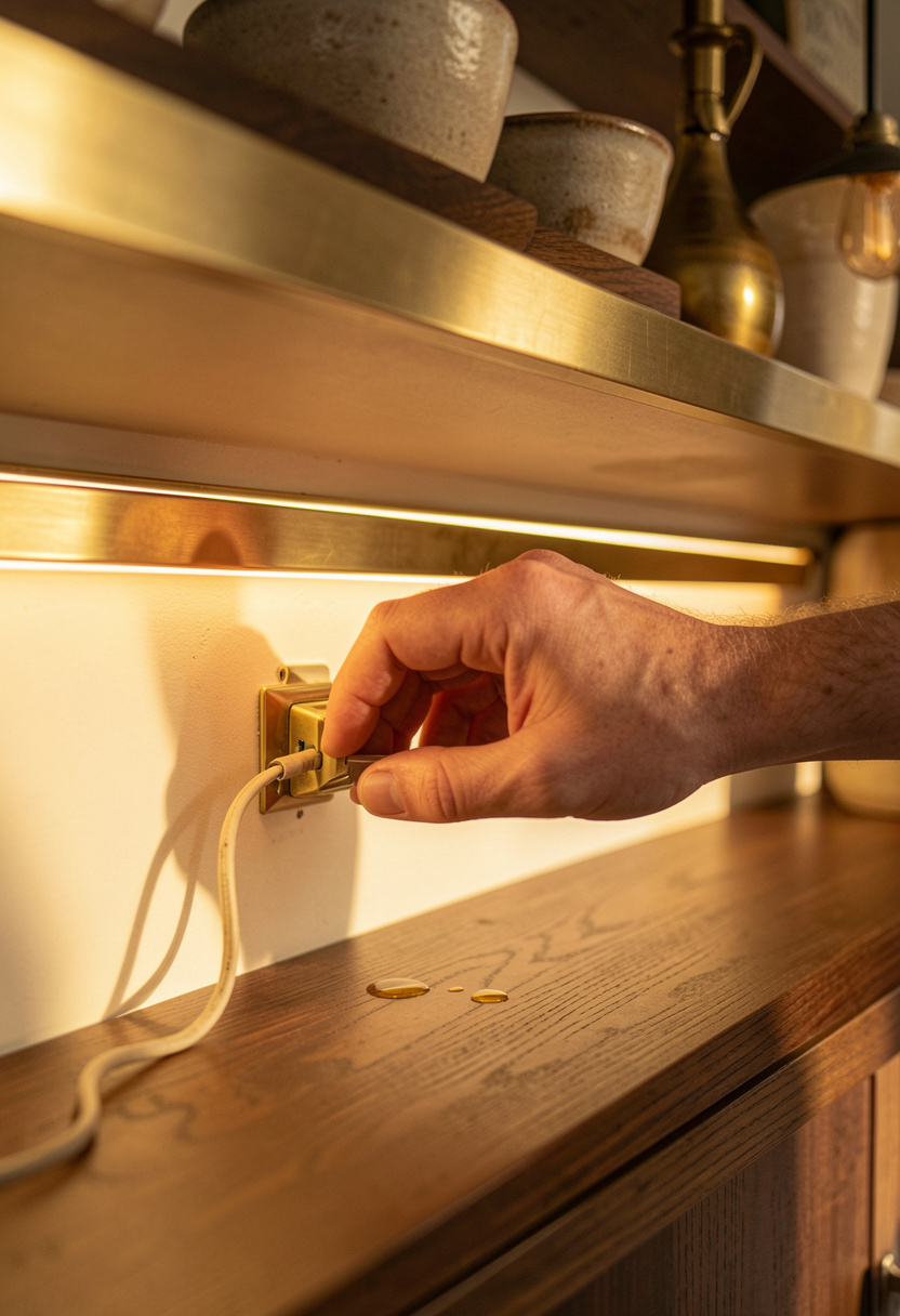
Lighting defines color. I swapped harsh cool LEDs for warm dimmable under-cabinet strips so the acrylic finish reads cozy at night and crisp in the day.
Try Warm dimmable under cabinet LED lights and a pendant like Rattan pendant light 15 inch. Add Beeswax taper candle pack of 6 for layered glow.
Principle: color temperature impacts perceived hue. A warm light makes acrylic cream read golden, a cool light makes it flat. Avoid the common mistake of relying only on overhead cool lighting. Swap in warm accents to keep colors alive.
5. Lock It In with Low-Commitment Color Tests
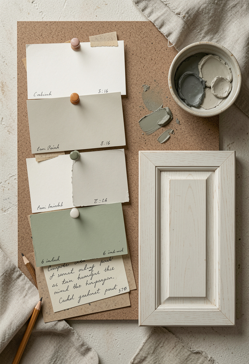
Test large before committing. I painted three 12 inch MDF boards with candidate acrylics and lived with them for a week.
Useful buys: Large paint sample cards set and Mini cabinet door sample kit.
Rule: view samples at morning, noon, and night. Pick the version you still like at night. That’s the one that survives trends.
Common Styling Mistakes to Avoid
Mistake: Lining up canisters at identical heights
Why it doesn't work: Looks flat and staged. Eye needs movement.
Do this instead: Vary heights in odd numbers and use a Matte white ceramic canister set with acacia wood lids.
Mistake: Choosing the brightest white sample on the shelf
Why it doesn't work: It can clash with warm counters and age poorly.
Do this instead: Test a warm off-white like the Acrylic cabinet paint satin off white next to your countertop.
Mistake: Overcrowding open shelves
Why it doesn't work: Collecting many small items reads busy and dated.
Do this instead: Edit to 60 percent full and display a Neutral stoneware plates set of 6.
What You'll Need for This Look
Foundation Pieces
Acacia cutting board 20×14 around $25 to $50
Acrylic cabinet paint satin off white approx $25 to $40
Large acacia fruit bowl around $20 to $45
Textiles & Soft Goods
Sage linen dish towels set of 4 approx $18 to $35
Neutral woven kitchen rug 2×3 ft around $25 to $60
Lighting
Warm dimmable under cabinet LED lights approx $30 to $80
Rattan pendant light 15 inch around $45 to $120
Finishing Touches
Matte white ceramic canister set with acacia wood lids around $35 to $50
Neutral stoneware plates set of 6 approx $40 to $80
Budget Swaps
Vintage ceramic pitcher similar at thrift stores, $12 to $40 on Amazon
Small reclaimed shelf bracket pair budget option $10 to $25
Shopping Guide for This Look
Time It Right: Buy paint and hardware in late spring when sales are common, try Acrylic cabinet paint satin off white for sample runs.
Thrift Hack: Mix one thrifted platter with new Neutral stoneware plates set of 6 for a collected feel.
2025 Trend Tip: If you want an accent, pick sage or clay items like Sage linen dish towels set of 4 to nod to rising palettes.
Splurge vs Save: Splurge on lighting like Rattan pendant light 15 inch, save on towels and canisters.
Conclusion
Start with a single cabinet door or sample board and live with it for a week under all lights. That small step prevents costly regrets.
One last rule I use: if the color still looks good on a rainy evening, it will survive trends.
Which cabinet color are you leaning toward for your kitchen?